Piet Mondrian

Piet Mondrian (1872-1944), one of the pioneers of abstract art, is known for his use of primary colours and simple geometric shapes. Whilst his work is highly recognisable, his philosophy that art should reflect the spiritual world is less known. Until 3rd September 2023, Tate Modern is exploring Mondrian’s life, work and philosophies alongside Hilma af Klint (1862-1944), a lesser-known female abstract artist.

Pieter Cornelis Mondriaan was born in Amersfoort, the Netherlands on 7th March 1872 to strict Protestant parents. His father, of the same name, worked as a head teacher but was also a qualified drawing teacher. Having been introduced to art at a young age, Mondrian entered the Academy for Fine Art in Amsterdam after qualifying as a primary school teacher. For some time, he managed to combine his career in education with his love of art, producing naturalistic and Impressionistic paintings in his spare time.

Most of Mondrian’s early works are landscapes featuring pastoral scenes. Influenced by his home country, Mondrian frequently painted windmills, rivers, fields and trees. Whilst these were representational works, Mondrian experimented with the many art movements of the late 19th century, including Impressionism, pointillism and Fauvism. By 1893, he had enough work to display at his first exhibition.

Mondrian’s early works begin to show a degree of abstraction as he started to experiment with different colour palettes, for instance, red, yellow and blue. The trees and other features gradually became less distinct, such as Gray Tree (1911), which Mondrian produced while staying in Paris. While living in France between 1911 and 1914, Mondrian changed his surname from Mondriaan to Mondrian and took inspiration from the Cubist artists Pablo Picasso (1881-1973) and Georges Braque (1882-1963). Although Gray Tree contains a measure of representation, the branches are more angular and geometric than in his previous work.

In 1908, Mondrian developed an interest in Helena Petrovna Blavatsky’s (1831-91) Theosophical Society, which believed it was possible to gain a spiritual knowledge of nature. Through his work, Mondrian determined to seek this knowledge. Mondrian and other artists, such as Hilma af Klint, sought to present spiritual concepts visually using abstract techniques and colours. Joining the Dutch branch of the Theosophical Society in 1909 had a greater impact on Mondrian’s aesthetic than the myriad of competing art movements.

While Mondrian was visiting his home country in 1914, the First World War began, forcing him to remain in the Netherlands for the next four years. During this time, he resided in the artists’ colony in Laren, where he met Bart van der Leck (1876-1958) and Theo van Doesburg (1883-1931). Although Mondrian had experimented with primary colours in the past, Van der Leck’s exclusive use of the colours red, blue and yellow had a profound impact on Mondrian’s artwork. Van Doesburg, whilst using a wider range of colours, encouraged Mondrian to continue developing his Cubist style.

Gradually, Mondrian’s work became less pictorial and moved away from Cubism. Together with Van Doesburg, Mondrian founded De Stijl (“The Style”), also known as Neoplasticism, in 1917, which advocated pure abstraction. Whilst Cubism is an abstract movement, De Stijl reduced visual compositions further to vertical and horizontal lines and shapes, using only black, white and primary colours.

Between 1917 and 1918, Mondrian published an essay called Neo-Plasticism in Pictorial Art in instalments in the new movement’s magazine, also called De Stijl. Mondrian believed traditional representation art only focused on the external world, whereas geometric abstraction created a sense of balance and harmony to emphasise the internal qualities of the universe. Mondrian also maintained that the fundamental principles of the universe could be demonstrated in grid-like compositions.

After the First World War, Mondrian returned to Paris, where he remained for two decades. Here, he fully embraced “pure abstract art” and produced some of his most iconic artworks. Mondrian began by painting grid-like compositions consisting of thin black lines forming rectangles, which he filled with blue, red, yellow, grey or white paint. Over time, the black lines increased in thickness, and the number of geometric shapes reduced.

Although digital and photographic versions of Mondrian’s paintings appear flat, that is not the reality. The black lines are the flattest parts of the compositions, whereas the coloured sections are built up from many layers of paint. Close examination reveals Mondrian only moved the paintbrush in one direction when applying red, blue or yellow, but the white sections have brush strokes running in several different directions.

“Holland has produced three great painters who, though a logical expression of their own country, rose above it through the vigour of their personality – the first was Rembrandt, the second was Van Gogh, and the third is Mondrian.” So said Katherine Dreier (1877-1952), a founder of New York City’s Society of Independent Artists, after visiting Mondrian’s studio in Paris. Dreier purchased one of Mondrian’s paintings and exhibited it in the United States at the end of the 1920s.

During the 1930s, Mondrian significantly reduced the amount of colour in his compositions. He began to focus on the impact of lines, frequently doubling them up to create a new dynamism. These paintings are visually busier than his earlier grid-style canvases.

Due to the rise of Fascism, Mondrian left France for London in 1938, where he resided for two years. After Paris fell to the Nazis in 1940, Mondrian left Europe altogether, settling in Manhattan, New York. Mondrian continued to produce grid-like compositions, which, despite their simplicity, took hours to execute.

Moving to America brought about a significant change in Mondrian’s work. Rather than using black lines and blocks of colour, Mondrian began using red, yellow and blue lines instead. New York City (1942) is one example of Mondrian’s new style. The lines towards the top of the painting are denser than at the bottom, which some critics suggest represents the sky.

Using strips of tape, Mondrian experimented with the position of the lines before painting directly on the canvas. The technique is evident in the unfinished painting New York City I, which has some similarities to the completed New York City. The unfinished work hangs in the Kunstsammlung Nordrhein-Westfalen in Düsseldorf, Germany. Last year, an unearthed photograph of the painting in Mondrian’s studio proved the artwork had been hung upside down in the gallery.

The grid-like cityscape in Manhattan inspired many of Mondrian’s artworks during the years he spent in America. He also took inspiration from the people in the city, particularly the jazz scene. Broadway Boogie Woogie (1943) incorporates rigid architecture and jazz tones by dividing the composition into more squares than previous works. Mondrian replaced solid lines with small adjoining rectangles of colour. Some critics suggest Mondrian captured the neon lights that dotted the city during the night.

“Mondrian’s life and his affection for music are mirrored in the painting [and that it is] a testimony of the influence which New York had on Mondrian.” So said Jürgen Stoye about the unfinished artwork Victory Boogie Woogie. Whilst some lines and shapes are complete, pieces of coloured paper indicate where Mondrian intended to paint. Stoye believed the music scene of New York began to influence Mondrian more than the grid-like architecture. Mondrian’s decision to rotate the canvas by 45 degrees may support this theory.

Despite Mondrian’s reputation for abstract art, he had a secret passion for painting flowers. He began producing floral images early in his career before branching out into Cubism and De Stijl, yet, Roses in a Vase (1938-1940) proves Mondrian continued to work on these subjects in private. Mondrian claimed to his close friends that he only painted flowers for commercial reasons, but the truth of this claim remains uncertain.

Piet Mondrian passed away on 1st February 1944 from pneumonia at the age of 71. Nearly 200 people attended his memorial service in Manhattan, including the artists Marc Chagall (1887-1985) and Marcel Duchamp (1887-1968). Mondrian left his estate, including the copyright to all his works, to his friend Henry Holtzman (1912-87), who had arranged Mondrian’s passage from London to New York in 1940. When Holtzman passed away in 1987, his children established the Mondrian/Holtzman trust to look after the paintings until the copyrights expired in 2015.

As an artist, Mondrian has inspired and continues to inspire many people. Art critic Robert Hughes (1938-2012) described Mondrian as “one of the supreme artists of the 20th century” who “believed that the conditions of human life could be changed by making pictures”. With such a distinctive and recognisable style, Mondrian’s work was quickly appropriated by other artists, particularly fashion designers. Before his death, Hermès designed a range of bags based on Mondrian’s latest paintings. Three decades later, Yves Saint Laurent released the 1965 Mondrian collection, featuring Mondrian’s iconic black lines and blocks of primary colours.

In 2008, the athletic footwear company Nike released a pair of trainers based on Mondrian’s De Stijl paintings. Since the copyright on Mondrian’s work expired in 2015, the amount of Mondrian-inspired fashion has risen considerably. A quick search on Google finds dresses and shirts on sale at Shein, Etsy, and ASOS. Dutch companies, such as the Miffy Shop, based on illustrations by Dick Bruna (1927-2017), have also embraced Mondrian’s style.

Modern art is subjective and open to interpretation. Some people may not appreciate Mondrian’s unique style or understand his work, but it does not diminish the fact that it has had a huge impact on the art world. Designers have put Mondrian’s pleasing patterns to good use, incorporating them into fashion and graphic design. Yet, beneath the layers of paint is an artist attempting to create a sense of balance and harmony in a world full of war, hate and fear.

To view some of Piet Mondrian’s paintings and notebooks in conjunction with Hilma af Klint, visit the Forms of Life exhibition at Tate Britain. Tickets are available until 3rd September 2023 and cost £20. Some concessions are available.


If you would like to support my blog, become a Patreon from £5p/m or “buy me a coffee” for £3. Thank You!

Inventing Modern Art

For the next few months, visitors to the National Gallery have the opportunity to discover what happened when artists broke with established traditions to create new art movements. After Impressionism: Inventing Modern Art spans the decades between 1880 and the First World War. Impressionism had already shaken the art world, encouraging other artists to experiment with new, modern ideas. The exhibition explores Neo-Impressionism, radical non-naturalist styles, avant-garde artists, Fauvism and Cubism with examples from well-known artists.

The exhibition begins with The Sacred Grove (1884/9) by Pierre Puvis de Chavannes (1824-1891), who Vincent van Gogh dubbed “the master of us all”. The mural-like painting depicts an ancient grove populated by the muses of the arts. Whilst the scene is a nod towards classical art, the simplified forms, flattened areas and limited colour palette are examples of the ways artists of the 19th century broke away with tradition.

The Museum of Fine Arts in Lyon commissioned Puvis to produce a painting for public display, which served both educational and patriotic purposes. Political opinion still divided France between the Republicans and the Royalists, so the gallery hoped for something to unite the two factions and create a new identity for the country. Critics described The Sacred Grove as a Utopia, and whilst some disliked the limited colours, it gave the painting a dream-like quality.

Puvis included the nine Greek muses and a few nymphs and angels, which makes it difficult for some viewers to determine the figures’ identities. It is generally agreed that Polyhymnia of Rhetoric, Clio of History and Calliope of Epic Poetry are seated in the centre of the painting. Thalia of Comedy and Terpsichore of Dance are in deep discussion towards the left while Euterpe of Music and Erato of Love Songs fly above. Melpomene of Tragedy is recognisable from her dark clothes and melancholic pose, while Urania of Astronomy lies on the riverside.

Bathers, painted between 1894 and 1906 by Paul Cezanne (1839-1906), demonstrates Neo-Impressionism, which evolved from Impressionism. Whilst Cezanne drew upon classical pastoral and nude scenes, his execution is rather crude and the bodies distorted. The painting depicts a frieze of eleven naked women relaxing in a woodland glade, which some liken to Titian’s Diana and Actaeon (1559), although Cezanne had no mythological motive.

Cezanne’s artwork is flat and compressed. Although each woman is distinct, their featureless bodies appear as a single mass when viewed from different angles. The scene is predominantly built up from shades of blue, contrasted with touches of orange and brown. Darker blues indicate shadows and trees, which adds perspective to the otherwise flat canvas.

Bathers appeared in the Cezanne memorial exhibition held the year after his death in 1907, which attracted the likes of Henri Matisse and Pablo Picasso. Critics argue whether Cezanne’s crude portrayal of the human body was deliberate or whether he lacked skill. Cezanne once admitted he felt too shy to hire models, so he relied on paintings in galleries for inspiration.

Although opinions were divided over Cezanne’s work, it is evident he influenced many people. Homage to Cézanne (1900) by Maurice Denis (1874-1943) depicts a scene in the shop of the art dealer Ambroise Vollard (1866-1939), who is selling Cezanne’s still-life Fruit Bowl, Glass and Apples. Vollard stands behind the easel, keeping it upright while a crowd of men gather to view the artwork.

The majority of the figures in Homage to Cézanne represent Les Nabis, a group of artists who transitioned from Impressionism to abstract art. They admired Cezanne’s work for its bright, almost unnatural colours. Artists depicted by Denis include Édouard Vuillard, Paul Ranson, Ker-Xavier Roussel and Pierre Bonnard. Denis also inserted a self-portrait and, on the right-hand side, his wife, Marthe. The two men in the foreground are Paul Sérusier and the symbolist painter Odilon Redon. The former is attempting to explain why Les Nabis enjoy Cezanne’s works.

Ironically, Denis’ Homage to Cézanne turns away from the Neo-Impressionist style and Les Nabis by reverting to classicism. Denis produced the painting after a visit to Rome, where he studied classical sculpture and artwork. On his return, Denis argued that classicism was at the core of French cultural tradition. Following a final exhibition in 1900, Les Nabis decided to go their separate ways.

The painting depicted in Homage to Cézanne originally belonged to Paul Gauguin (1848-1903), another artist Les Nabis admired. The exhibition features a handful of works by Gauguin, including Vision After the Sermon (1888), which portrays the Biblical scene of Jacob wrestling with an angel (Genesis 32:22-32). Gauguin initially followed the Impressionist movement but became disillusioned towards the end of the 1880s. Instead, Gauguin preferred a simplified style that reflected his passion for primitive objects and Japanese prints. As a result, Gauguin became the leader of a small group of artists known as Synthesists.

Synthetism was a type of symbolism focusing on artists’ feelings about their subject and the aesthetic considerations of line, colour and form. Painters of this style included Gauguin, Bonnard, Charles Laval, Cuno Amiet and Maurice Denis, the latter of whom summarised synthetism: It is well to remember that a picture before being a battle horse, a nude woman, or some anecdote, is essentially a flat surface covered with colours assembled in a certain order.

The influence of Japanese prints is evident in the red background of Vision After the Sermon. Rather than painting a conventional landscape, Gauguin used a flat colour upon which the exaggerated shapes of the figures stand out. Although he used shading on the clothing of the Breton women witnessing the fight between Jacob and the angel, the colours are minimal. The flat tree trunk across the centre of the painting separates the women from the Biblical event, symbolising the women are either having a vision, praying or thinking about the story in the sermon they have just received.

Gauguin spent several years in Breton, evidenced by the women in Vision After the Sermon. Around the same time, he visited his friend, Vincent Van Gogh (1853-90), in Arles. Van Gogh was a troubled soul who spent his later years in southern France before being confined to a mental institution following Gauguin’s visit. Van Gogh did not belong to a particular art movement, but his work inspired many, including the Fauves and the Expressionists.

The authenticity of Sunset at Montmajour (1888) remained questioned for many years after Van Gogh’s death because it was one of the few paintings he did not sign. It depicts scrub land with the ruins of Montmajour Abbey in the background. Van Gogh’s style is distinctive, with bright colours and thick, directional strokes. The authenticity of the painting was confirmed in a letter Van Gogh sent to his brother Theo, in which he described the yellow rays over the bushes as a “shower of gold” and the distant fields as blue and purple.

Working at a similar time to Van Gogh and Gauguin, although in a completely different style, was Hilaire-Germain-Edgar Degas (1834-1917). Degas is predominantly associated with paintings of ballerinas, but he also focused on women in general, such as in Combing the Hair (‘La Coiffure’) (1896). Rather than asking women to pose for him, Degas captured women in secret to create a natural, innocent portrait.

Women combing their hair features in more than one of Degas’ paintings, but this is the only one that uses unnatural colours. Degas limited his palette to fiery orange-reds, a creamy white and black. Apart from a curtain, the background contains no detail, making the ordinary scene feel claustrophobic. The choice of colour suggests the lady had naturally red hair, but it is perhaps also a metaphor for the pain the woman felt while her maid brushed out the matted hair.

Some sections of Combing the Hair are more defined than others. The maid’s clothing contains more detail than the woman in red, who is either pregnant or misshapen. Some claim the picture is unfinished, but others note that Degas suffered from poor sight during his later years, making drawing and painting difficult tasks. His lack of eyesight may explain his choice of colour, which is much stronger than the pastel tones usually associated with Degas.

Two years after Degas’ death, the Fauvist painter Henri Matisse (1869-1954) purchased Combing the Hair, no doubt attracted to the bright, unnatural colour. Unlike Degas, Matisse frequently used models and sitters, as seen in his Portrait of Greta Moll (1908). Moll was a sculptor who attended Matisse’s art school, which opened in 1908. Moll had previously had her portrait taken by Lovis Corinth (1858-1925), which Matisse disliked. Matisse offered to paint a better portrait for 1000 francs, although with no obligation to buy it if Moll prefered Corinth’s attempt.

Three years before painting Greta Moll, the 1905 Salon d’Automne in Paris labelled Matisse and his associates Les Fauves, which meant “the wild beasts”. The term referenced Matisse’s use of bright colours, frenetic brushstrokes and broken lines. By 1908, Matisse wanted to distance himself from the label and understood that a portrait needed to be recognisable, although he still wished to use expressive colours.

Although Moll posed for over three hours, Matisse produced a simplified depiction of the human body. Rather than focusing on detail, Matisse concentrated on the placement of colour, for instance, the warm reddish-brown of Moll’s hair next to the cool blue background.

French artist Georges Seurat (1859-91) also focused on the placement of colour. Seurat devised painting techniques known as chromoluminarism and pointillism, which separated colour and form into tiny dots. The Channel of Gravelines, Grand Fort-Philippe (1890) is the only example of Seurat’s work in the exhibition and dates to the year before his untimely death. Seurat spent a great deal of time on the coast of the Channel, producing landscapes of small port towns, such as Gravelines. Unlike Matisse’s expressive use of colour, Seurat preferred subdued tones.

The Channel of Gravelines, Grand Fort-Philippe is much paler than Seurat’s earlier works, which makes the scene feel deserted. The painting is divided into sky and land, which helps create a sense of depth in an otherwise flat artwork. Only on close inspection are the tiny, pointillist dots visible on the canvas. From a distance, the sky and harbour appear as a wash of colour.

The concentration and colour of the dots produce the outlines and very subtle shading on the boat and houses in Seurat’s landscape. Seurat reserved the darker colours for a painted border, which creates a transition between the painting and the frame. To compliment the shades in the scene, Seurat used deep indigo on the lower frame, reflecting the sky above, and yellow on the upper frame, in reference to the sand below. Several artists adopted Seurat’s technique, including the frame, but the style was short-lived, perhaps due to the painstaking method of producing thousands of tiny dots.

In 1897, a group of Austrian painters formed the Vienna Succession, another short-lived art movement. Before the group split in 1905, it attracted many up-and-coming artists, including Gustav Klimt (1862-1918), known for his use of gold leaf in paintings. Yet, the only painting by Klimt in a British public collection contains no golden features.

Portrait of Hermine Gallia (1904) depicts a wealthy Jewish lady who wanted to establish herself in a predominately Catholic society. Gallia chose Klimt to produce her portrait because he was the most avant-garde and expensive artist of the time. Being able to afford to hire Klimt emphasised Gallia’s wealth and suggested she did not hesitate to embrace modern ideas.

Klimt paid little attention to Gallia’s face, instead concentrating on the pose and fashionable dress. Instead of using gold leaf, as in his seductive portraits of women, Klimt focused on the layers of translucent creamy white chiffon. Many believe Klimt selected or designed the dress specifically for Gallia’s portrait, despite it being a challenging material to paint. Klimt successfully depicted the outfit with long sweeping brushstrokes of thin paint, which allowed the priming of the canvas to show through, creating a translucent effect.

Max Pechstein’s (1881-1955) Portrait of Charlotte Cuhrt (1910) demonstrates another method of portraiture of the early 20th century. Also described as an avant-garde painter like Klimt, Pechstein developed an Expressionist style influenced by Van Gogh and Matisse. He used dynamic brush strokes and highly saturated colours, which became a crucial feature of the artistic group Die Brücke (The Bridge) that he joined in 1906.

The full-length portrait depicts 15-year-old Charlotte Cuhrt in a bright red dress, sitting confidently in an armchair. Her dark hat and flamboyant ring emphasise her status as the daughter of the successful solicitor, Max Cuhrt. The flat background contrasts with the shaded lines of Cuhrt’s clothing, making her appear three-dimensional in a two-dimensional world.

The shape of the canvas fit an altar-like frame, which added to the decorative scheme of Max Cuhrt’s apartment. The architect, Bruno Schneidereit, described the flat as a Gesamtkunstwerk (a total work of art) because every aspect of architecture, furniture and decoration coexisted in aesthetic harmony. Pechstein assisted Schneidereit with the design so that he would understand how his portrait of Charlotte would complete the room.

The final room of the exhibition introduced artists such as André Derain (1880-1954), Georges Braque (1882-1963), Pablo Picasso (1881-1973) and Piet Mondrian (1872-1944), who led the way forward in modern art. Before the World Wars, Braque and Picasso established Cubism, which offered an alternative way of portraying the world through fragmented shapes. Mondrian also embraced Cubism but went on to develop abstract art and De Stijl. As modern art became accepted, artists felt free to experiment with different styles and rarely stuck to one movement throughout their career. This is evident in Picasso’s work, which entered a Surrealist phase after the Second World War.

It is impossible to define modern art because there are so many branches, as shown in the After Impressionism exhibition. To say that modern art is everything that came after Impressionism does not enlighten anyone. The National Gallery attempts to chronologically reveal the progression of art, but it quickly becomes evident that there is no linear timeline. Styles came and went and inspired new methods, while some artists, for instance, Matisse, briefly stepped backwards to produce portraits for specific clients.

The National Gallery recommends allowing an hour to visit the After Impressionism exhibition. Some visitors may prefer to stay longer or return another day because there is so much to take in. Modern art does not appeal to everyone, but the curators have enabled visitors to appreciate why styles changed and what inspired the artists involved.

After Impressionism: Inventing Modern Art is open until 13th August 2013. Standard admission costs between £24 and £26, although concessions are available. Members of the National Gallery can visit the exhibition for free.


My blogs are now available to listen to as podcasts on the following platforms: AnchorBreakerGoogle PodcastsPocket Casts and Spotify.

If you would like to support my blog, become a Patreon from £5p/m or “buy me a coffee” for £3. Thank You!

The Face of a Stranger

220px-schjerfbeck

Last exhibited in London almost 130 years ago, the Royal Academy of Arts have reintroduced Helene Schjerfbeck to UK audiences. Virtually a stranger in Britain, Schjerfbeck is a Finnish national icon known for her abstract self-portraits, landscapes and still lifes. The exhibition, due to end next week (27th October 2019), highlights the evolution of Schjerfbeck’s art, demonstrating her fascination with superficial appearance and what lies beneath.

Helena Sofia Schjerfbeck was born in Helsinki on 10th July 1862, the third child of office manager Svante Schjerfbeck and Olga Johanna (née Printz). At the time, Finland was an autonomous Grand-Duchy within the Russian Empire and the Schjerfbeck children were brought up speaking Swedish. By the end of her life, Helene Schjerfbeck could speak Swedish, French, English and German but not, ironically, Finnish.

When Schjerfbeck was four years old, she broke her hip after falling down some stairs. As a result, she would always walk with a limp and was unable to attend school. To cheer her up, her father gave his daughter drawing materials to keep her occupied during hours of immobility. Little did anyone know that this act would have such an impact on her destiny.

By the age of 11, Schjerfbeck was producing remarkable drawings for someone so young. After the drawings had been shown to the Finnish genre painter Adolf von Becker (1831-1901), Schjerfbeck was enrolled as the youngest ever member of the Finnish Art Society in Helsinki. Becker, who was a tutor at the school, paid for her tuition.

helena_westermarck_by_schjerfbeck

Portrait of Helena Westermarck, 1884

The school taught its students to draw by copying other artworks and sketching sculptures or, occasionally, life models. Copying famous artists was something that would play a huge role in Schjerfbeck’s future. During her four years of study, Schjerfbeck won many awards and began to spell her name as Helene to distinguish herself from her newfound friend and future artist and writer, Helena Westermarck (1857-1938). The selection of Schjerfbeck’s early work at the exhibition includes a portrait of Helena.

Sadly, Schjerfbeck’s father died after a bout of tuberculosis in 1876 and never saw his daughter graduate from the Finnish Art Society, which she achieved the following year. Had Becker not been paying for Schjerbeck’s education, the working-class family would not have been able to afford the fees. Schjerfbeck’s mother began taking in boarders to get by.

After graduation, Schjerfbeck began studying at Westermarck, von Becker’s private academy in Helsinki. Again, her tuition was paid for, allowing her to study for two years under von Becker’s guidance. During this time she learnt how to work with oils and paint from memory. She continued to win many prizes and had some of her work displayed in the Finnish Art Society’s annual exhibition in 1880.

Schjerfbeck continued winning prizes after graduating, including a prize awarded by the Senate of Finland for her painting Wounded Soldier in the Snow. With the prize money, she was able to travel abroad to continue her studies. Along with Helena Westermarck, Schjerfbeck moved to Paris to study at Mme Trélat de Vigny’s studio. The following year, they both enrolled at the Académie Colarossi, where they studied for a short time before returning to Finland.

In 1883, the Imperial Senate presented Schjerfbeck with a scholarship that allowed her to return to the French capital and exhibit at the Salon for the first time. She also spent time in the emerging artist’s colony Pont-Aven in Brittany. Whilst there, Schjerfbeck developed a new, expressive style that can be seen in her painting Clothes Drying and The Door. The latter is a small, modest painting showing light spilling from under a closed door. Produced while sitting in Tremalo Chapel, Pont-Aven, Schjerfbeck ignored the altars and sculptures that attracted other artists in favour of the unassuming door. The only evidence that she is in a church is the stone archway to the right of the door.
Allegedly, Schjerfbeck became engaged whilst in either Brittany or Paris, however, her unknown fiancé wrote to her breaking off the engagement. All correspondence between the pair was destroyed by her friends and Schjerfbeck returned to Finland in 1884.

Schjerfbeck did not remain home long before she was awarded another grant from the Finnish Art Society. In 1887, she returned to Paris but spent the summer in St Ives, Cornwall at the invitation of her friend Marianne Preindlesberger (1885-1927), who she had befriended during her studies. The summer soon became autumn, winter and then spring before Schjerfbeck returned to Paris. In 1889, she repeated the trip once more.

The atmosphere and quality of light in St Ives inspired many artworks. She rented a tower and attended art classes led by Preindlesberger’s husband Aidan Scott Stokes (1854-1935). Her paintings took on a plein-air style, which was well received and included landscapes and portraits, such as, View of St Ives and Woman with a Child. She also paid a small fee to set up her easel in a local bakery, where she painted the stone kitchen, capturing the warmth of the room and bread.

Between 1887 and 1890, Schjerfbeck exhibited several times in London at the Institute of Painters in Oil Colours in Picadilly. During this time, she painted The Convalescent, which won the bronze medal at the 1889 Paris World Fair. The painting was later purchased by the Finnish Art Society.

Schjerfbeck’s grant ran out at the end of the decade and she returned to Finland in 1890. Again, she did not remain in Finland for long before being commissioned by the Finnish Art Society to travel to St Petersburg to make copies of paintings in the Hermitage Museum. These included works by Frans Hals (1582-1666) and Diego Velázquez (1599-1660). After this, she travelled to Vienna to make more copies of paintings in the Kunsthistorische Museum, followed by Florence to do the same in the Uffizi Gallery.

When in Finland, Schjerfbeck worked as a drawing teacher at the Finnish Art Society. Whilst she was an excellent instructor, she felt it hindered her artistic flow. She felt cut off from fellow Finnish artists who were embracing new techniques and styles. She also found the demands of teaching physically taxing and fell ill in 1895.

Schjerfbeck recovered her health at a Norwegian sanatorium and quickly returned to work. Unfortunately, she had to take another year off in 1900 when she fell ill again. As a result, she decided to resign from her position at the Finnish Art Society and move in with her mother in the town of Hyvinkää.

Whilst taking care of her mother, Schjerfbeck continued to paint and exhibit her work. She used her mother as well as local women and children as her models then sent final pieces to be shown at the Turku Art Society, an association for professional visual artists. Many of her works during this period were influenced by artists she had seen on her travels. As well as masters from the past, she was also inspired by artists of her era, for instance, Paul Gauguin (1848-1903) and Paul Cézanne (1839-1906).

During her visit to Vienna, Schjerfbeck encountered artworks by Hans Holbein the Younger (1497-1543), whose influence can be seen in her painting, Maria. Her choice of colour recalls the blue-green backgrounds of Holbein’s portraits of royalty. She also included the word “Maria” in a gold serif typeface, which again is similar to Holbein and his contemporaries.

Inspiration was also taken from the early Renaissance frescoes Schjerfbeck had seen in Italy. She produced her painting Fragment imagining it to be a section of a much larger scene. Using several layers of oil paint, Schjerfbeck scraped sections of the top layer to reveal the colours hidden beneath. In doing this, she produced what looked like a fragment of a deteriorating Renaissance fresco.

Caring for her mother meant Schjerfbeck did not get many opportunites to leave the town of Hyvinkää. Her growing fame, however, did not prevent her from receiving a number of visitors. In 1913, a young art dealer Gösta Stenman (1888-1947) met with her in person to purchase several of her paintings. He also encouraged her to exhibit more widely and eventually became her principal dealer.

Another visitor was the artist and writer Einar Reuter (1881-1968). Although much younger than her, Schjerfbeck hoped a romantic relationship could be sparked between the two, however, it was not to be. Nonetheless, Reuter became a good friend and featured in a handful of her paintings. In 1919, Reuter sat for his portrait, however, the year before, he had sat for her in the guise of a sailor. This is a demonstration of Schjerfbeck’s fascination with superficial and true appearances.

Despite being thirty miles north of Helsinki, the Finnish Art Society commissioned Schjerfbeck to paint a self-portrait. In 1914, no other female artist had been invited to do the same and she felt vindicated by this commission, having been estranged from the society for so long. She submitted the result, Self-Portrait, Black Background, in September 1915.

Schjerfbeck’s self-portraits are evidence of her changing style and technique. She produced her first self-portrait at the age of 22, which demonstrated the methods she had been taught whilst leaning slightly towards impressionism. By 1915, however, her style had completely altered. No longer did she delicately paint her facial features, preferring to use flat shapes and colour instead. Her face has barely any sense of depth and her body is angular and flat.

Towards the end of her life, Schjerfbeck’s self-portraits became gradually more abstract, less human, and more alien or death-like. Her mother had died in 1923 and her health was deteriorating rapidly twenty years later. The Soviet Union invaded Finland in 1939, sparking the Winter War and the fighting impacted heavily on her life. Evacuated several times to various sanatoriums, eventually ending up in Sweden, Schjerfbeck was anxious, lonely and unwell. With old age and her impending death on her mind, her self-portraits expressed her fears and depression rather than her true likeness.

Fortunately, life during the 1910s was generally good for Schjerfbeck. In 1917, she organised her first solo exhibition in Helsinki, bringing together 159 paintings. From this success, her first biography was published by Reuter under the alias H. Ahtela. Unfortuntely, it was only published in Finnish, therefore Schjerfbeck could not read it.

Whilst Schjerfbeck was celebrating her success, the Russian Revolution was in progress, which allowed Finland to declare independence. In order to establish a cultural identity, the new sovereign began to promote Finnish artists. In 1920, the state awarded Schjerfbeck the Order of the White Rose of Finland and a state pension. This marked her as one of the country’s best artists.

Shortly after her mother’s death, Schjerfbeck was taken seriously ill, moved to the town of Tammisaari and hired home help. Despite her health, she enjoyed living in the town, continuing to paint local women and children. She also painted relatives who came to visit, for instance, her nephew Måns Schjerfbeck (1897-1973). Once again, Schjerfbeck explored the fine line between superficial and real, painting a portrait of Måns in an imaginary role of The Driver. She also based paintings on her favourite works, such as El Greco’s (1541-1614) profile of the Madonna.

There was no chance of Schjerfbeck being lonely in Tammisaari; she was so famous that on her 70th birthday she had to hide to avoid all the well-wishers. None of this prevented her artistic success and she continued to receive an annual salary from her principal dealer Stenman. Her fame was also spreading on the continent with solo exhibitions in Sweden, Germany and France. The Royal Swedish Academy of Fine arts invited her to enrol as a foreign member in 1942, along with Pablo Picasso (1881-1973).

As well as portraits, Schjerfbeck produced many still-life paintings, taking inspiration from Cézanne. Many of these are abstract and focus intently on the relationship between space, tone and colour. Whilst she had produced still-lifes in the past, they became a predominant feature of her final years. Sent from place to place to avoid the war, Schjerfbeck painted the things around her, particularly fruit. Her final painting was Three Pears on a Plate, which is full of the sense of death and decay, similar to her self-portraits.

On 23rd January 1946, while staying at the Grand Hotel Saltsjöbaden in Sweden, Helene Schjerfbeck passed away at the age of 83, her easel by her bedside. Her ashes were buried alongside those of her parents in Helsinki and, later in the year, an exhibition toured Sweden and Finland in her memory. Ten years later, Schjerfbeck was posthumously selected to represent Finland at the 1956 Venice Biennale. To date, she remains Finland’s best known and most admired artist.

“Dreaming does not suit me. To work, to live through work, that is my path.”
– Helene Schjerfbeck

If Helene Schjerfbeck is Finland’s greatest artist, why is she not better known in the UK? Unlike on the continent, Schjerfbeck did not exhibit in the UK as often and, being a woman, tended to be overlooked. A planned exhibition in the USA was prevented by the war, diminishing her chances of becoming well-known on another continent.

Another reason for her lack of popularity is her work is not easy to categorise. Whilst her earlier work falls into the impressionist bracket, her mature work is a blend of cubism, post-impressionism and abstract expressionism. As a result, she gets omitted from exhibitions about individual art movements.

With the assistance of the Royal Academy, Helene Schjerfbeck has returned to the UK where a new generation has learnt her name and admired her work. Seventy-three years after her death, Schjerfbeck finally gets the chance to earn fame in other countries. But how long will it be before the whole world recognises her face?

The Helene Schjerfbeck exhibition can be viewed at the Royal Academy of Arts until 27th October 2019. Tickets are £14 and concessions are available. Under 16s are free when accompanied by a fee-paying adult.


My blogs are now available to listen to as podcasts on the following platforms: AnchorBreakerGoogle PodcastsPocket Casts and Spotify.

If you would like to support my blog, become a Patreon from £5p/m or “buy me a coffee” for £3. Thank You!

Bowling on Through the Years

“The possibilities of paint are never-ending.”
– Frank Bowling, 2017

frank_bowling_09

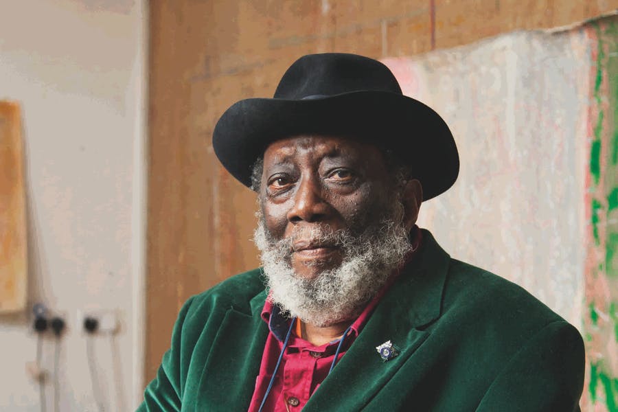
For the first time in his career, the 85-year-old Frank Bowling has been honoured with a major retrospective of his life and artwork by Tate Britain in London. The exhibition offers the chance to view the best of Bowling’s works and discover an artist that many know little or anything about. His large canvases dominate the rooms and show off his unique techniques, including his “Map Paintings” and “Poured Painting”. Being the first black man to be elected to the Royal Academy of Arts, it is surprising Frank Bowling is not better known.

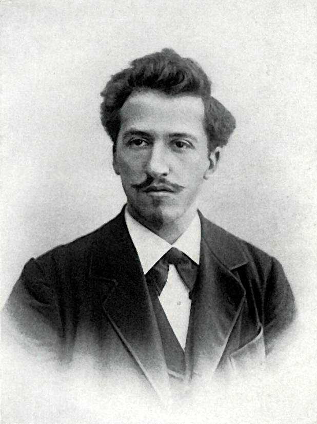
Richard Sheridan Patrick Michael Aloysius Franklin Bowling, shortened to Frank, was born on 26th February 1934 in Bartica, British Guiana (now Guyana). His father, Richard Sheridan Bowling, was a police paymaster and his mother, Agatha Elizabeth Franklin Bowling was a seamstress. When Frank was six-years-old, the family moved to New Amsterdam on the Berbice River in the north-east of the country where his mother established the Bowling’s Variety Store. Frank grew up helping his mother, which included washing the feet of beggars who came to the store for a meal. His father, on the other hand, showed him very little love.

In 1953, Bowling flew to England to live with an uncle and finish his education. He dreamed of becoming a writer or poet but soon after he had finished school, he was drafted into the Royal Air Force for two years. After this, the young South American decided to train as a painter, first enrolling at the Regent Street Polytechnic, then the Chelsea School of Art. In 1959, Bowling was awarded a scholarship to the Royal College of Art’s (RAC) Painting School where he became acquainted with other talented students, including David Hockney (b.1937) and Ronald Brooks Kitaj (1931-2007).

In 1960, Bowling was expelled from the college after marrying Paddy Kitchen, a writer and art critic, who was a member of staff at the time. Despite this, Bowling was determined to persevere with his art and enrolled at the Slade School of Fine Art, University College London for one term. Here, he began to develop a taste for the artist Francis Bacon (1909-92), which is evident in his earlier work. Fortunately, the RAC was persuaded to readmit Bowling, which is where he finished his art training. His letter of readmission is on display in the exhibition.
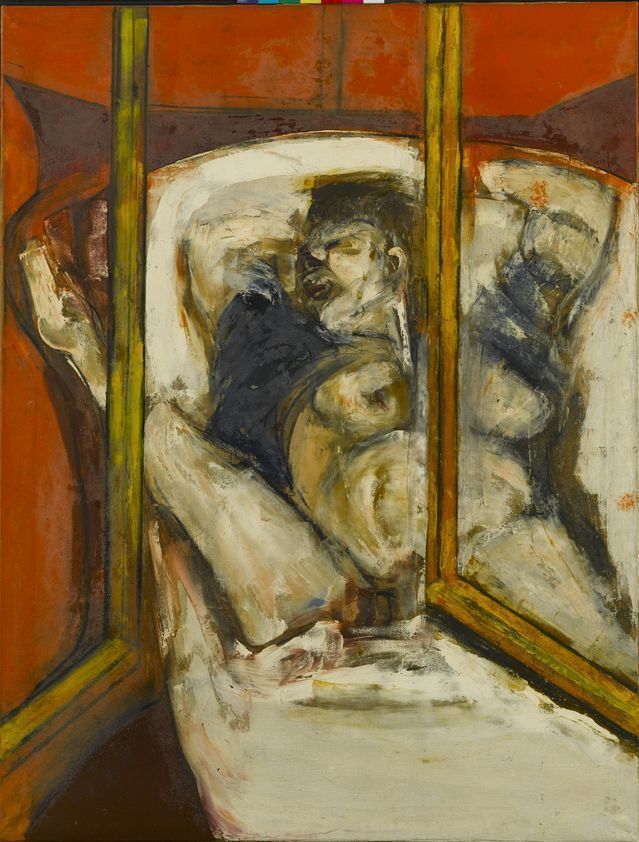
Birthday, 1962

Birthday, 1962

Bowling’s penchant for abstract art was clear during his time at art college. When the students were asked to produce a painting on the theme of birthdays, Bowling did not go down the obvious route. Instead, he produced an impressionistic oil painting of a woman giving birth. When he was younger, Bowling witnessed a neighbour giving birth and the intense pain he observed stayed in his mind for many years.

Titled simply Birthday (1962), Bowling appropriated Francis Bacon’s style of composition, including line work and brushwork. Whilst the open window is fairly lucid and geometric, the figure of the woman in labour is blurred and distorted.

As well as Francis Bacon, Bowling was influenced by a number of artists he met. In 1961, he visited New York where he viewed work by people such as Jackson Pollock (1912-56). Pollock’s technique of pouring or splashing liquid household paint onto a horizontal surface was something Bowling would incorporate into his own work later in life.

Unfortunately, many of Frank Bowling’s early works have been destroyed or are missing. He worked in many different London studios during the early 1960s and many paintings were left behind or mislaid whenever he moved. Amongst the missing is a painting Bowling produced in response to a political event. In 1961, the Democratic Republic of the Congo earned their independence from Belgium and installed their first president, Patrice Lumumba (1925-61). Martyrdom of Patrice Lumumba was produce after the president was murdered later that same year.

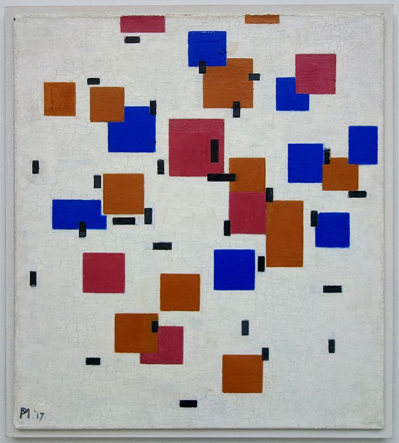
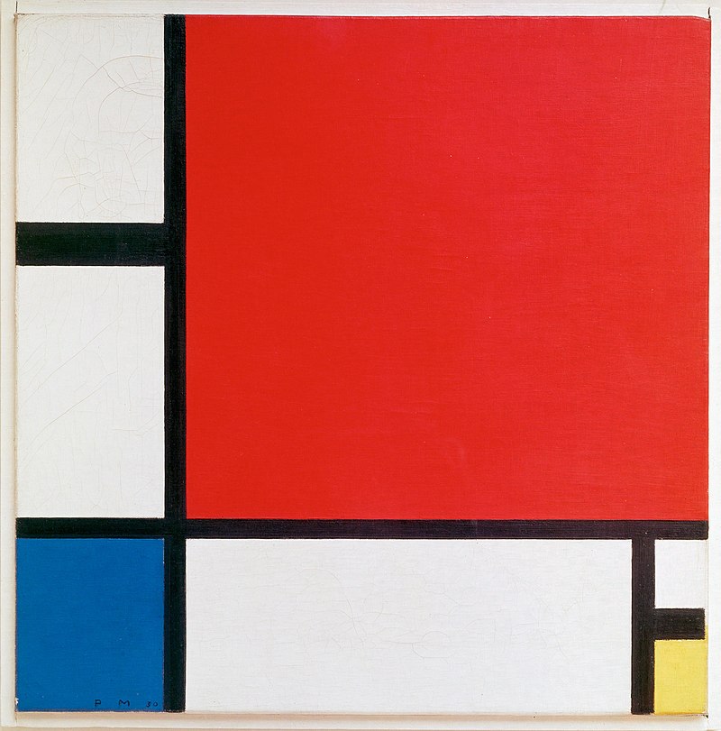
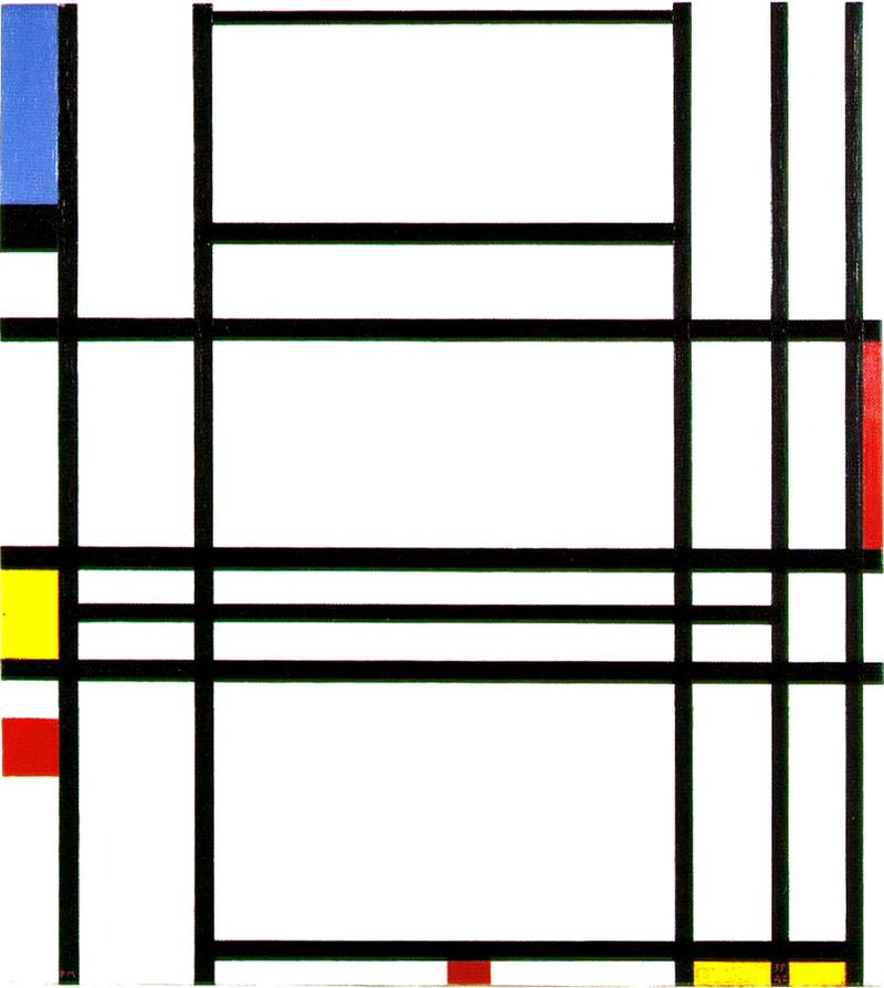
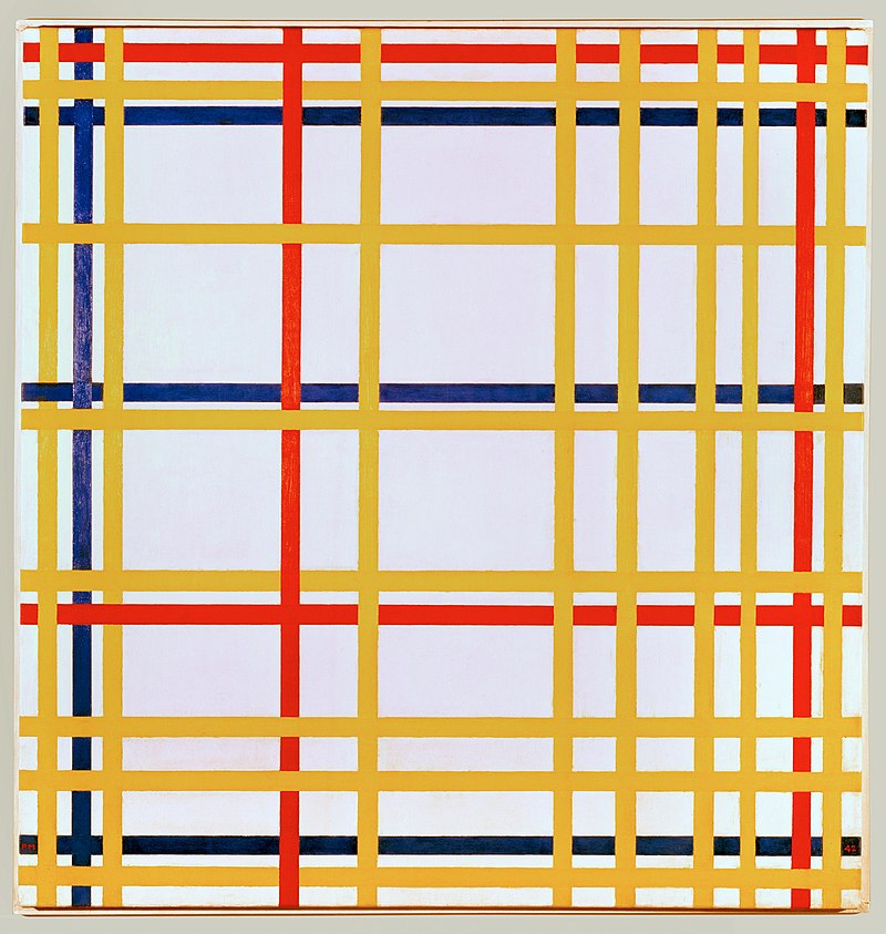
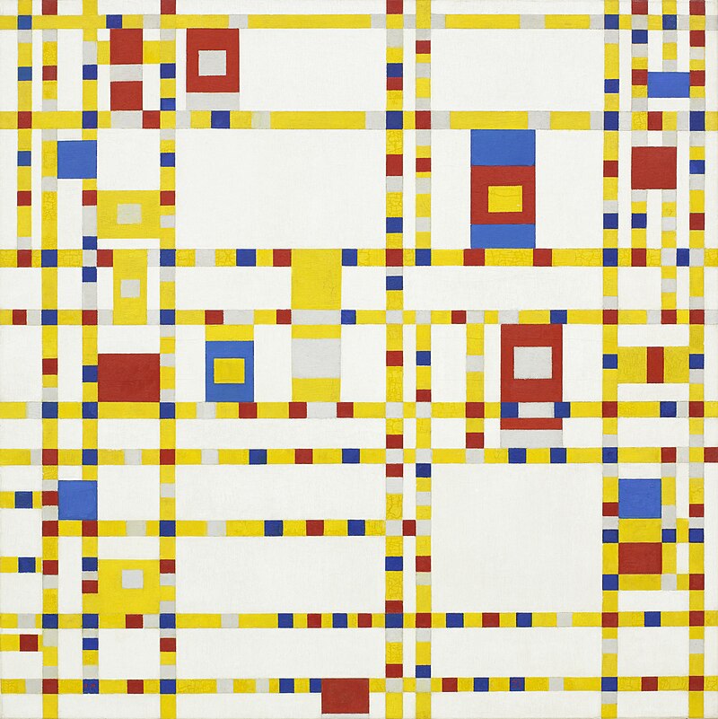
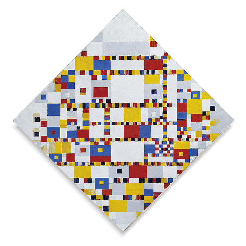
The year 1962 was quite significant for Frank Bowling. Firstly, his eldest son Dan was born to Paddy Kitchen, shortly followed by his second son Benjamin to another woman, Claire Spencer. Evidently, his marriage to Paddy did not last long. In the same year, Bowling graduated from RCA after writing a thesis about Piet Mondrian (1872-1944). The Dutch painter’s style was another influence for Bowling’s work.

On graduating, Bowling was awarded the silver medal for painting, with David Hockney winning gold. He was offered a travelling scholarship to Rome but requested he visit Barbados, Trinidad and Guyana instead. This was his first trip home in over a decade.

Toward the end of 1962, Bowling held his first major exhibition at Grabowski Gallery in London. His painting Birthday was purchased by the Arts Council and he was able to meet lots of new people who would become friends and mentors.

In his early career, Bowling frequently produced artworks in response to events or things he had witnessed. He produced a series of paintings titled Swan, which was based upon a dying swan drenched in oil he had come across on the River Thames. He used thin, rhombus-shaped canvases for these paintings, an idea he took from an American painter, and filled them with coloured stripes, which was a concept inspired by someone else. His dying swans are painted on top of the geometrically decorated canvases in a less precise manner, almost as if they are moving in an attempt to escape.

Bowling’s swan theme continued in his large scale painting Big Bird (1964). The pattern of the background, reminiscent of Mondrian, is a stark contrast to the expressively abstract birds. In 1965, this painting was submitted to the First World Festival of Negro Arts in Dakar, Senegal where it won the grand prize for painting. Bowling was not overly keen about participating in the exhibition because he did not want to be categorised as a Black painter. He wanted to be regarded as an artist without his ethnicity taking centre stage. Later in life, he remarked that he felt suffocated by his background and frustrated that the art world focused more on his skin colour than his paintings. He observed that Guyana often felt like the heavy rock the Greek king Sisyphus was doomed to repeatedly roll up a hill.

Despite his aversion to being remembered for his geographic and ethnic backgrounds, Bowling’s life in Guyana featured heavily in his paintings, particularly his childhood home. Bowling continuously experimented with different pictorial approaches and techniques, which included photography and silkscreen. Using photographs of his childhood home, Bowling created a stencil that he could repeatedly use to print the image onto his canvases. In his painting Cover Girl (1966), for example, the image of his old house floats in the background. The “cover girl” in question is based on a photograph of the Japanese model Hiroko Matsumoto (1926-2003) that Bowling found in a copy of the Observer. The dress is inspired by the designs of the French fashion designer Pierre Cardin (b.1922) and the hairstyle by British-American hairstylist Vidal Sassoon (1928-2012).

Painted at a similar time was the carefully worked out composition Mirror (1964-6). Whilst it contains many similar features, for example, the geometric backgrounds and Bacon-esque figures, there is no screen print of Bowling’s childhood home. Instead, Bowling includes two portraits of himself, one standing at the bottom of the stairs and one swinging from the top. The figure in between is Paddy Kitchen to whom he was still married. This particular painting fuses together several different styles, suggesting a rebellion against convention.

By 1964, Bowling had a third son, Sacha, with yet another woman, Irena, who he later married, although they would eventually divorce. The same year, he returned to New York and became acquainted with abstract expressionist Jasper Johns (b.1930). As well as painting, Johns was a sculptor and included found objects on his canvases. This is another idea Bowling would take up later in his career.

Frank Bowling relocated to New York in 1966, the same time that his marriage to Paddy came to an end. The following year, he was awarded the Guggenheim Fellowship, which helped him establish himself in America. He moved into a studio in SoHo, New York, where he lived and worked until 1975.

From 1967 until 1971, Bowling worked on what would become known as his “map paintings”. Tate Britain described these as “Fields of colour … overlaid with stencilled maps of the world and silkscreened images.” Bowling applied paint to the canvas by pouring or spraying, whilst using cut out stencils of various continents, particularly of the southern hemisphere, to block out certain areas, leaving a print of the shape in its place. He also used photographs of his sons or people he met in Guyana on a trip in 1968 with the photographer Tina Tranter.

South America Squared (1967) was the first “map painting” Bowling produced. The square shapes on the red canvas show that he had not quite left behind the influence of Piet Mondrian. To create the shape of South America, Bowling created a stencil with an epidiascope. This technique was introduced to Bowling by his American mentor Larry Rivers (1923–2002).

Polish Rebecca (1971) was named after Bowling’s friend Rita Reinhardt, the widow of the abstract painter Ad Reinhardt (1913-67). She had suffered tragedy during the Second World War when both her parents and sister were murdered during the Holocaust. Although the only “maps” represented are of South America and Africa, Bowling is hinting at the connection between the extermination of Jews in Europe with the dispersion of Jews in the southern regions.

Despite not wanting to be dictated by his past, all of Bowling’s “map paintings” are connected to his roots. Barticaborn I (1967), which was used on promotional material for the exhibition, refers to Bowling’s place of birth. Bartica is situated at the junction of three rivers: Cuyuni, Mazaruni and Essequibo. When visiting New Amsterdam with Tranter, they also went to Bartica to gather inspiration for Bowling’s work.

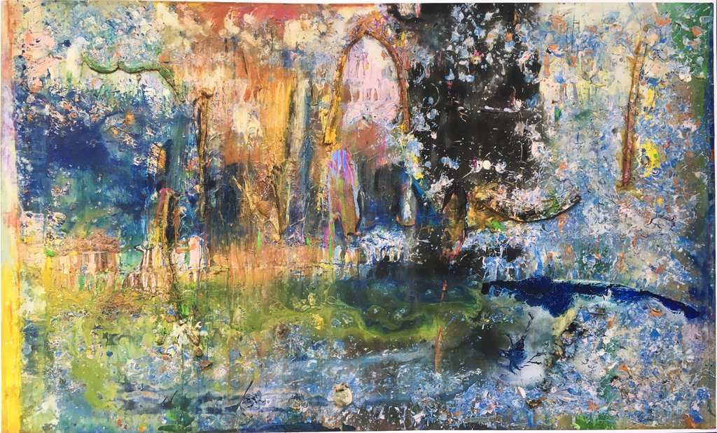
Around 1973, Bowling began using a new technique, which, although no mention was made in the exhibition, is likely inspired by the work of Jackson Pollock. This sudden change in his method may also be associated with the end of his marriage to Irena.

Bowling began experimenting by pouring different coloured paint onto a canvas and watching them merge together. In his New York Studio and later in his London Studio, which he took up in 1984 and still uses today, he set up a tilting platform, which allows him to pour paint from a height of two metres. The colours spill down the canvas, producing an unpredictable pattern.

All of Bowling’s “poured paintings” are a result of chance. He never began with an idea in mind; he let the flow of the paint take charge. He always titled the outcomes once he was finished, using the events of his daily life and the people he knew for inspiration. The ambiguously titled Ziff (1974) is a typical example of this style of work. Bowling filled the background with colour in a similar manner to his “map paintings” before applying liquid paint whilst the canvas was on the tilted platform.

Kaieteurtoo (1975) was named after having a conversation about the Guyanese tourist attraction Kaieteur Falls. This is the world’s largest single drop waterfall by volume of water flowing, which stands at a height of 226 metres and has a width of 113 metres. This name felt appropriate because the dripping paint almost resembles a cascade of water.

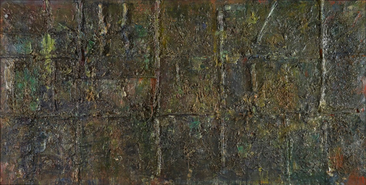
Toward the end of the 1970s, Bowling was applying a growing number of contrasting techniques. As well as using his tilting platform, he used combined washes of paint, spattering and splotching. Although these were similar methods to the aforementioned Pollock, there is no doubt that the results are unique to Frank Bowling. An example of this is At Swim Two Manatee (1977-8), which has a greater density than some of his previous works. By using these unpredictable techniques, Bowling said he was making “painting happen almost as if I didn’t do anything about it.”

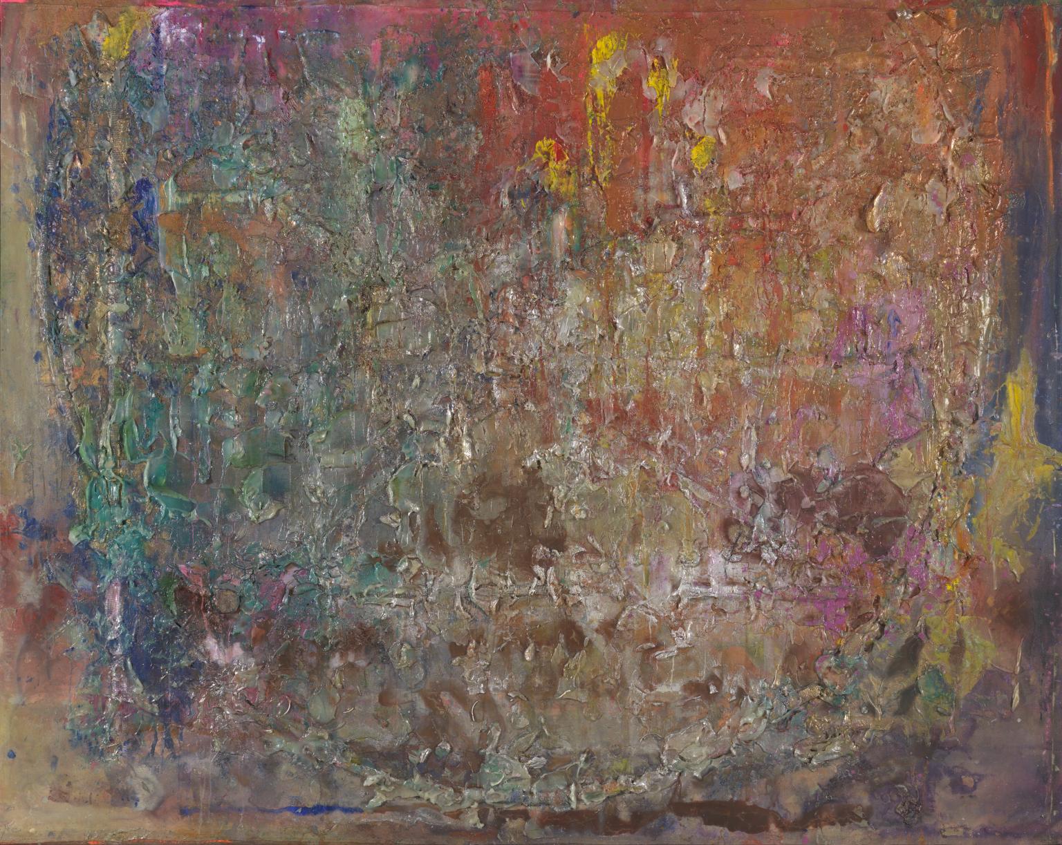
Due to the randomness of the applied paint, some of Frank Bowling’s works were the result of happy accidents. Vitacress (1981), for example, looks like a cosmic sky featuring a moon or planet. This round imprint, however, was the result of leaving a bucket on a drying canvas. Despite being unintentional, Bowling loved the result and used the “technique” in future paintings.

A selection of paintings at the Tate Britain is labelled “cosmic space”, however, this was never Bowling’s intention. As previously stated, Bowling never began an artwork with an idea in mind but let the flow of the paint dictate the outcome. By adding ammonia and pearlescence to the acrylics, the blending of colours produced a marbling effect, which in turn made them resemble cosmic space. Despite this, Bowling did not give them space-related titles, for instance, Ah Whoosh Susanna (1981).

As well as out-of-this-world results, some of Bowling’s artworks also resembled underwater scenes, for instance, Moby Dick (1981). The ammonia and turpentine also produced chemical reactions, which along with the water, altered the consistency and colour of the acrylic paint, allowing a smoother finish than other “poured paintings”.

Bowling was still experimenting with techniques and media well into the 1980s. In 1983, he purchased a flat in Pimlico, not far from the Tate Britain, where he still lives today. He spent his time being with his sons, visiting Tate and working on his art. At Tate, he became familiar with J.M.W. Turner (1775-1851) and John Constable (1776-1837), whose use of colours sparked future ideas.

Perhaps inspired by Jasper Johns, Bowling began sticking found objects onto his canvases. These included plastic toys, packing material and oyster shells. As well as acrylic paint, he also used acrylic gel, acrylic foam, chalk, beeswax and glitter, all of which added to the texture of the final outcomes. Bowling tended to stick the items onto the canvas before applying paint using his pouring method. The weight and fluidity of the mixture occasionally dragged the items downwards into unplanned positions. Towards Crab Island (1983) is an example of this.

As always, Bowling named his paintings after they had been created and they were usually an unplanned experiment. During a summer residency at Skowhegan School of Painting and Sculpture, Maine, however, Bowling was inspired by the rural landscape and forests, which he attempted to explore in his work. Without changing his method of working, Bowling produced Wintergreens (1986) using earthy colours to represent the scenery. He added several strips of acrylic foam, almost reverting to his geometric patterns from the 1960s. Although the paint obscures most of the found objects, there is apparently a cap of a film canister and a plastic toy owl hidden on the surface.

In 1987, Tate acquired its first painting by an artist of Afro-Caribbean descent: Frank Bowling’s Spreadout Ron Kitaj (1984-6). The title pays homage to Bowling’s fellow student at the RCA, R.B. Kitaj. Once again, Bowling created a design with acrylic foam, which was then dislodged when the paint was added. He describes these strips of foam as “the ribs of the geometry from which I worked.” Amongst the strips are bits of plastic jewellery, toys and oyster shells.

Bowling’s engagement with colour came to a height at the end of the 1980s. With landscape artists such as Turner, Constable and Thomas Gainsborough (1727-88) in mind, Bowling began work on a series titled Great Thames. Two examples are on display in the exhibition. His choice of colour and luminous paint capture the play of light on the water at different times of the day.

“It’s exciting and challenging to work in London, Turner’s town, and the pressures of the weight of British tradition is exhilarating.”
– Frank Bowling
b80dd2b12e7edf05b4f8669d9cabd12a

Sacha Jason Guyana Dreams, 1989

In 1989, Bowling was persuaded to participate in The Other Story: Afro-Asian Artists in Post War Britain at the Hayward Gallery. Despite his scepticism about being labelled by his ethnicity, curator Rasheed Araeen (b.1935) convinced him it was worth taking part. At this time, Bowling was thinking a lot about Guyana and his childhood, particularly following the death of his mother in 1988. Accompanied by his son Sacha, he returned to Guyana where he produced paintings based on the landscape. In 1990, Bowling purchased a loft studio in Dumbo, Brooklyn and split his time between London and New York.

In 1993, Bowling made his first trip to Africa to attend A/Cross Currents: Synthesis in African Painting in Senegal where he won the Pollock-Krasner award. He won the award again in 1998.

In the 1990s, Bowling experimented with composition, occasionally sewing more than one completed canvas together, for example, Girls in the City (1991). He also began to work on smaller canvases than in the past and began to reduce the number of found objects he incorporated into his work. He stopped using acrylic foam completely and smoothed the acrylic gel with a spatula, rather than leaving it to dry in textured lumps. Bowling stated the reason he stapled seven canvases together in Girls in the City was to represent “the way people structure themselves … we live in buildings and express life in opposition to minimalism, enclosure and death.”

In the exhibition, there is at least one painting named after each of his sons, for instance, Benjamin’s Mess (Hot Hands) (2006). Unfortunately, Bowling’s eldest son Dan died in 2001, which prompted him to start using a lot of white in his works as a form of memorial. Despite the grief, Bowling continued to take part in exhibitions, for example, at the Venice Biennale in 2003 and at Tate Britain in 2004. The following year, 2005, Bowling became the first Black artist to be elected to the Royal Academy of Arts in London.

As well as naming paintings after his sons, Bowling titled them after other people he knew or admired. Orange Balloon (1996) was produced for Paul Adams (b.1977), who was both the youngest player in the South African cricket team and the first Black player. The painting itself has little to do with cricket or the cricketer.

Despite needing to sit down due to his age and diminishing mobility, Bowling continues to create art today, employing all the techniques he developed over six decades. Looking at Remember Thine Eyes (2014), it is evident that Bowling still uses his tilted platform, however, because he needs to stand in order to do this, he has only used the one colour (yellow) and possibly only one lot of pouring. The “eyes” have been created by resting two buckets on the wet surface – a technique he accidentally invented in 1981. The title comes from a line in Shakespeare‘s King Lear.

For parts of his artworks, Bowling is assisted by his wife, Rachel Scott who he married in 2013, although had been with since 1977, and his long-term friend Spencer A. Richards. Due to the spontaneity of Bowling’s work, it does not matter if either of them makes mistakes when carrying out Bowling’s instructions.

One of Bowling’s most recent works is Wafting (2018) in which he reverts to using tangible material. The polka dot material, purchased by his grandson Samson in Zambia, has been torn into strips and positioned on top of the canvas. It is not certain whether Richards or Rachel assisted with the fabric, however, Bowling does most of the painting himself, laying canvases on the floor so that he can pour on different colours from a seated position.

Although Frank Bowling’s artworks may not be palatable to everyone, it is a shame his name is not well known. Surely being the first Black man elected to the Royal Academy would have cause for celebration and be an event people would remember? On the other hand, Bowling does not want to be known as a Black painter, he wants his paintings to speak for themselves. After viewing a lifetimes work, it is easy to pick Frank Bowling’s paintings out of a crowd. Beforehand, however, you could be forgiven for expecting him to be a white man; after all, how many Black artists can you name?

By putting emphasis on Bowling’s wish not to be labelled as a Black man, Tate Britain inadvertently draws attention to his geographic and ethnic background. As Bowling said himself, it is something he cannot escape from. Even his artworks continually refer back to his homeland, whether in title or theme.

In the Tate Etc magazine, art critic Matthew Collings mentions that Bowling was disappointed not to see any literature about himself in the lobby of a past exhibition. There were plenty of publications about the other (white) artists who took part, which made it hurt even more. Although racism is less of a problem today, the majority of Bowling’s career as been plagued with adversity.

Some people will love his paintings and others will not understand them, however, regardless of this, Frank Bowling has received what he deserves: a retrospective of his life and career. With the exhibition virtually on his doorstep, Bowling can see his work being appreciated and enjoyed by different generations and know that it is not his skin colour they are interested in but the paintings on display. Finally, he has achieved what he has always wanted.

The exhibition Frank Bowling closes soon on 26th August. Tickets are £13, however, members of the gallery can view for free.


My blogs are now available to listen to as podcasts on the following platforms: AnchorBreakerGoogle PodcastsPocket Casts and Spotify.

If you would like to support my blog, become a Patreon from £5p/m or “buy me a coffee” for £3. Thank You!

See Differently

675x286-exhibition-banner-normal

Detail from Jean-Auguste-Dominique Ingres and workshop, ‘Odalisque in Grisaille’, about 1824–34

Spanning 700 years of art, the National Gallery’s Autumn/Winter exhibition focused on the world of shadow with over 50 paintings produced with a limited colour palette. Monochrome: Painting in Black and White explored the reasons artists, both Old Masters and modern, reduced their selection of paint to white, black and grey, and the effects this produced. Beginning in the Middle Ages, the exhibition spanned seven rooms, each tackling a different time period or aspect. For a medium that is usually full of colour, monochrome paintings alter the manner in which artists work as well as the way their audience perceives them.

As shown in a video at the beginning of the exhibition, curators Lelia Packer and Jennifer Sliwka explained the various reasons an artist may prefer to work in black and white. The reduction of colour helps to focus the viewers’ attention on a particular subject, concept or technique. What may have been missed in a painting full of colour, is exaggerated by its absence. Working in monochrome allows the artist to experiment with form, texture and mark making, with particular emphasis on light and shadow.

15fc04107c509cca004635d65a64702a

A Woman in Netherlandish Dress Seen from Behind – Albrecht Dürer

During the 16th century, most artists were producing colourful paintings, influenced by the rapidly growing Renaissance movement originating in Italy. Yet, the National Gallery managed to produce examples of monochrome painting from this era. Black and white paint was a lot cheaper than the majority of coloured pigments, therefore it was more economical for artists wishing to practice on a separate canvas before completing their final piece, to do so in grey tones. This also allowed artists to work out how light should fall upon their figures or models and to determine which sections would be obscured by shadow.

The use of monochrome within artworks, however, began a long time before the Renaissance era. The exhibition introduces visitors to the term grisaille which defines “a painting executed entirely in shades of grey or of another neutral greyish colour.” This method first appeared in the middle ages, particularly in buildings belonging to the Cistercian Monks. Prohibiting colour by religious command, the stained glass windows of many 13th century churches were created with translucent glass in various grey tones, the opposite to the vibrant, eye-catching patterns that Christian structures contain today. This was an attempt at eliminating distraction from prayer and devotion to God; whether this was successful is undivulged.

An example of grisaille stained glass windows is the ‘stained glass panel with quarries and a female head’ owned by the Victoria and Albert Museum, dating back to circa 1320-24. As can be seen, the glass was not totally black and white, however, the only colour to feature is yellow, which the monks were unlikely to find off-putting.

Another example of a monochrome sacred subject is a four and a half metre high indigo cloth decorated with white paint to represent events in the life of Jesus. Titled Agony in the Gardenthis is a portable cloth originally created in Genoa in 1538, that could be moved from one chapel to another and be reassembled anywhere it is needed. To be produced only in white paint is extremely impressive. The tones and shadows have been created by the amount of paint applied, the more the brighter, which is the opposite method when using black paint.


st_barbara_1437

St Barbara 1437 Eyck, Jan van

Putting these sacred relics to one side, the earliest independent painting in grisaille, i.e. produced deliberately in monochrome, is Saint Barbara painted by Jan van Eyck (1390-1441) in 1437. It shows the early Christian Saint Barbara imprisoned in a tower by her pagan father. There is, however, some debate amongst art historians as to whether van Eyck intended the painting to remain black and white. The background of the canvas has been filled with blue and ultramarine paint, but the intentions behind this are unclear. Some argue that the colour draws attention to the ink and oil drawing in the foreground, whereas others insist the pen and brush strokes are an underdrawing for an unfinished painting – it was, after all, produced in the final years of van Eycks life. The only thing standing in the way of the latter debate is the date and signature of the artist found on the panel.

Regardless as to whether van Eyck was the first to experiment with monochrome painting, the origins of grisaille remain in the Netherlands area. Rembrandt van Rijn‘s (1606-69) famous Ecce Homo is an example of this technique, however, one Dutch artist became known for creating most of his work in monochrome. This was Adriaen van de Venne (1589-1662) who produced numerous grisaille paintings of peasants, beggars, thieves and characters of comic value.

Grisaille paved the way for artists to discover how to accurately represent stone in their paintings, particularly statues. This led to a rise in the technique called Trompe-l’œil (“deceive the eye”) in which the paintings are so realistic they create an optical illusion, making their subjects appear three dimensional. This lead to a paragone (comparison) debate amongst late Renaissance artists over which form of art – sculpture or painting – was the most superior. The painting was the most affordable of the two art forms, therefore, when artists began achieving the Trompe-l’oeil technique with the help of monochrome shading, commisions for fake carvings began to rise. Take, for example, Jacob de Wit’s (1695-1754) Jupiter and Ganymede. Produced in an era without electric lighting, it could easily be mistaken for the real thing.


Black and white artwork is far cheaper than coloured, which is something many artists kept in mind. Although paintings sell for millions nowadays, they were not as highly valued at the time of their completion. As paintings took a long time to complete, artists were frequently struggling to make ends meet in between successful payments. However, there was a solution to this predicament: printmaking. From the 1430s onwards, techniques such as etching and engraving became popular within the art world.  Rather than selling one unique painting, an artist or fellow printmaker could create a print of the artwork by etching on to a metal plate. This plate could be inked over and over again to create as many copies of the print as desired. Whilst artists could not charge the same amount for a print than they could for a painting, they were able to sell far more copies than they would otherwise.

fbf9f468cda3ba9e4235ceb2aa2c39a5

Ecce Homo print, van Vliet

Midway through the exhibition, the National Gallery showed examples of paintings and their corresponding prints. Often, a student or an apprentice would create the print on the artist’s behalf, thus being able to study the techniques of their master and perfect their drawing abilities.

One example is the print of Rembrandt’s Ecce Homo, which was produced by another Dutch artist, Johannes van Vliet (c.1610). The linear design is a contrast to the brushstrokes of the original, however, some may prefer imagery in this fashion.

Hendrick Goltzius (1558-1617) was an early graphic artist who preferred the effect of printmaking over the traditional painting. He is now regarded as the pioneer of “pen-painting”, a technique involving the use of pen and ink, drawn straight on to canvas, mimicking the look of a print. He was, therefore, able to produce artwork of considerable size, which would not have been possible on a printing press.

1453

Etienne Moulinneuf’s Back from the Market, c.1770

Goltzius was not the only artist to paint print-like scenes. Alongside the original, coloured version of Back From the Market by Jean-Baptiste-Siméon Chardin (1699-1779), hung what appeared to be two prints, however, one was not what it initially seemed. In 1770, Étienne Moulinneuf (1706-89) painted the engraving of Back From the Market, mimicking the print-marks from the printing press. He then went one step further, emphasising the difference between reality and illusion, by painting a trompe-l’oeil of broken glass over the top. This gives the false appearance that the painting (or engraving) is framed and had, at one point, fallen off the wall.

As the exhibition reached its final rooms, the dates of the paintings caught up with the recent 20th century. By now, technology was rapidly advancing and numerous art movements were coming forward, challenging all the rules that artists had followed for centuries. One of the challenges artists had to overcome was the invention of the camera. Commission for portraits and realistic scenes were no longer as popular because the public could produce their own in a photographic format in a shorter timeframe and at a fraction of the cost. Some artists responded to this by painting hyper-realistic black and white portraits that could easily be mistaken for a photograph, whereas others went down a route leading to abstract expressionism.

Chuck Close (b.1940), an American painter, produced a portrait of fellow artist Joel Shapiro (b.1941) that a camera could not possibly achieve. Spanning from floor to ceiling, the canvas is filled with black, and white squares containing hand painted rings of a number of grey shades. From a distance, the squares blur together to produce the portrait of Joel in a similar way that pixels merge together to create a digital image.

Vija Celmins (b.1938), a Latvian-American painter, also blurs the lines between real and abstract. Her painting Night Sky No.3 shows the stars in a way that cannot be seen by the naked human eye. However, as the exhibition pointed out, is it a painting of the night sky, or is it only white dots on top of black paint?


The exhibition’s penultimate room is where abstraction comes to the fore. After looking at paintings from the Old Masters and other well-known names, it is difficult to regard these final works as art. One canvas contains a slightly angular black square and another canvas is filled with black lines. Nonetheless, the fact that they are produced “without colour” means they have a right to be in the Monochrome exhibition. Although many will not understand what these artists were attempting to achieve, the minimal colour draws attention to the shapes and texture of the paintings. At a time when all colours are readily available, the complete lack implies a hidden meaning.

The final room of the impressive Monochrome exhibition was perhaps the one visitors spent the least amount of time in, however, it was also the most interesting. Containing an installation that Olafur Eliasson (b.1967) developed in 1997, Room For One Colour allows the viewer to see themselves and the people around them in monochrome. The immersive sodium yellow mono-frequency lamps on the ceiling suppress all other light frequencies, thus creating a monochrome world. It is unsettling to no longer detect individual colours especially as this causes the lines and textures of facial features to become more prominent. Unfortunately, the lights are difficult for the eyes to bear for longer than a minute, leaving just enough time to read the explanation the gallery supplied. Nevertheless, it was a fun and unique conclusion to a magnificent exhibition.


monochrome-x9249pp-slideshow

Room For One Colour


Unfortunately, Monochrome: Painting in Black and White closed on 18th February 2018 and many of the paintings will have returned to their original locations. However, that does not mean that grisaille, black and white, and monochrome art cannot continue to be celebrated. When attending any exhibition or art gallery, keep an eye open for the works with minimal colour and see how they compare to their more vibrant neighbours. Notice the tones, shading, shadows, and textures that may otherwise go unnoticed.

The National Gallery did a formidable job at introducing London to a colourless artworld. Not only did visitors get the opportunity to view paintings by 50 or so artists, a different way of looking at and producing art was presented. This was certainly one of the National Gallery’s top exhibitions.

“Artists choose to use black and white for aesthetic, emotional, and sometimes even for moral reasons. The historical continuity and diversity of monochrome from the Middle Ages to today demonstrate how crucial a theme it is in Western Art.”

National Gallery Director, Dr Gabriele Finaldi


Hockney: 60 Years of Work

I deliberately set out to prove I could do four entirely different sorts of picture like Picasso.

Until 29th May 2017, Tate Britain are exhibiting the life works of David Hockney (b1937), one of the most widely acknowledged artists of the present day. Displaying work from his early days as a student at the Royal College of Art right up until his newest works, the exhibition showcases the different styles and techniques Hockney experimented with during different periods of his life. Arranged in chronological order, the artwork tells the story of its creator as well as delving into the mind of a true artist.

Whilst studying in the 1960s, Hockney was subjected to the influences of a whole range of styles and artists. Although it is usually easy to identify a Hockney painting, his work as a student was vastly different. Inspired by abstraction, Hockney produced child-like canvases filled with splashes of paint, graffiti styled letters and numbers, phallic shapes and freehand drawings. Most of these artworks were related to themes of sex, love and homosexuality, which is suggestive of issues he may have been facing at this time.

Shortly after finishing college, Hockney moved on to new topics and new styles. Although his subject matter remained broad, he began focusing on more domesticated scenes. These, naturally, contained people, and are probably some of his more famous work. Later he got people to sit for him, however at the end of the 60s, Hockney was more focused on the people he observed around him. Often featured were naked figures, continuing his theme of sex and love.

For a large part of his life, Hockney has lived in the United States, relocating to Los Angeles as his career began to take off. Exposed to new scenery, climate and architecture, he began to use these as the focus points of his paintings. California is a state with one of the warmer climates, therefore items such as lawn sprinklers and swimming pools were fairly common. Whilst Hockney was beginning to take a naturalistic approach to art, he implemented a simple form of abstract style to capture the sense of water in motion. Therefore, his artworks were unique, not conforming to any particular movement.

Hockney soon moved on to portraits, although not commercially. Only painting people he was already acquainted with, Hockney carefully staged the compositions, combining informal poses and comfortable settings with the traditional portrait style. Hockney has become well-known for his portrait style – in fact, the Royal Academy exhibited a series of these in 2016. What makes these paintings most impressive is the choice of media and his resolution to paint everything from life. Choosing acrylic paint was a bold move; as artists will know, this paint drys quickly and cannot be removed from the canvas, therefore mistakes could not easily be rectified.

The 20th century saw the biggest changes in technology and, unlike artists from bygone eras, Hockney was able to attempt new ways of making art as each advancement appeared. In the 1980s, for instance, Hockney utilised the growing interest in photography, particularly in the form of the Polaroid camera, to create abstract works of art. Instead of photographing a scene in the traditional way, Hockney photographed each section individually, using the carefully positioned print outs to reveal the whole image – sort of like a jigsaw. This meant that the final outcome often had a double-vision effect as a result of overlapping sections where the model or scenery may have shifted, or the imprecise placement of the camera.

As the world entered the 21st century, even more options were presented to Hockney to manipulate into works of art. His most recent works have fully encompassed digital inventions, making him one of the most versatile artists of the time. Firstly, he embraced the world of film, using multiple cameras to create a cubist-like sequence showing the changing seasons of a particular scene in Yorkshire. The Four Seasons is on display toward the end of the exhibition, although examples can be found online.

Hockney has not left his drawing and painting behind however, but with the discovery of the iPhone and iPad, he has almost dismissed conventional sketchbooks, preferring to use digital apps to draw using his thumb or a stylus. Again, a few examples of these can be seen in the final room of the Tate’s exhibition.

To this very day, David Hockney continues to engage with his accustomed range of subjects, including portraits and still life. They may have taken on a more digital nature, however that does not stop them from being works of art. Despite his increasing age, it looks like the world can expect more Hockney masterpieces in the near future.