Throughout history, there have been many art movements. Baroque, for instance, flourished in Europe from the early 17th century until the 1740s. It began after the Renaissance and Mannerist periods and was followed by Rococo and Neoclassical styles, such as the Georgian Period in Britain. This year, Tate Britain is exploring how the Baroque style influenced architecture, painting, sculpture and other arts in a major exhibition British Baroque: Power and Illusion. The Baroque style can be recognised by deep colours, grandeur, a sense of movement, contrast and elements of surprise.
The Baroque style was introduced to Britain after the restoration of the monarchy in 1660 and lasted until the death of Queen Anne in 1714, encompassing the reigns of the last Stuart monarchs.


Between the death of Charles I in 1649 and the return of his son Charles II (1630-85) in 1660, the country had suffered under the “protection” of puritanical Oliver Cromwell (1599-1658). The Church of England had been changed beyond recognition, royal and Church estates had been sold and castles had been destroyed. After Charles’ coronation, the Church of England was restored and attempts were made to reconstruct the pre-revolutionary regime. Whilst this was successful, Charles also brought changes too, most particularly the Baroque style.
It is difficult to pinpoint exactly when Baroque art first developed, however, it had already been introduced to Britain before Charles II’s reign, mostly in architecture. Charles, however, was inspired by his cousin Louis XIV (1638-1715) of France, who was famed for the splendour of his court. Taking a leaf out of the Sun King’s book, Charles introduced hedonism and self-indulgence in place of moral purity.
“That star that at your birth shone out so bright,
It stain’d the duller sin’s meridian light,
Did once again its potent fires renew,
Guiding our eyes to find and worship you.-John Dryden, Astraea Redux
A poem on the Happy Restoration & Return of His Sacred Majesty Charles the Second, 1660
The relief of the public about the restoration of the monarchy was clear from the number of people that flocked to watch Charles II arrive at Whitehall Palace – an event that took two hours due to the crowd. The joy was expressed through poets, such as John Dryden (1631-1700), who likened Charles to mythological gods and Roman emperors. People believed the restoration of the British monarchy to be a God-given event and Charles’ coronation was bedecked in bright colours to celebrate the return of peace and prosperity.
The lavish decoration did not end there. In order to re-establish the royal court as the centre of power, Charles ordered splendour to be lavished upon all buildings belonging to the court. Palaces were not only restored but embellished and decorated to express their magnificence and importance. In Charles’ bedchamber at Whitehall Palace, John Michael Wright (1617-94) painted Astraea Returns to Earth on the ceiling to represent the King’s return to power. According to the Roman poet Virgil (70-19 BC), Astraea was the Greek goddess of Justice, whose return to Earth signified a new golden age. Likening Charles II to Astraea illustrated the hope for a better future.
Ceiling paintings were produced for the State Apartments as well as the more public rooms of many of the buildings belonging to the court. Many of them featured portraits of the King, such as the ceiling in the Withdrawing Room at Windsor Castle, of which only a fragment survives. Plans for the ceiling of St George’s Hall at the castle reveal Charles was depicted in the sky among important figures, including Jesus Christ.
Comparing Charles to god-like figures continued throughout his reign, such as in the complex painting The Sea Triumph of Charles II by Antonio Verrio (1639-1707). Whilst still celebrating the Restoration, the date of the painting suggests it was also in celebration of the end of the Third Anglo-Dutch War, which Charles ended with the signing of the 1674 Treaty of Westminster. Charles is depicted as Neptune, the Roman god of the sea, surrounded by cherubs holding symbols of peace. In the background, the Royal Fleet floats on the calm waters, emphasising they are no longer at war.
Charles II’s official state portraits are just as flamboyant as the allegorical ones. Whilst he poses in similar manners to his father, the colour of the clothing is highlighted, drawing attention to what he is wearing, for instance, the robes of the Order of the Garter. Baroque fashion was very different from types of garments previous kings and queens wore. Gone were the high-necked dresses from the Tudor period and the colours of male clothing almost appear clownish in contrast to the fashions of today.


Peter Lely (1618-80) was the King’s Principal Painter and was much sought after by other members of the court. He was commissioned to produced portraits of “court beauties” dressed in expensive silk to demonstrate the success and wealth of the Restoration Court. At the time, marriages were often arranged to bring together powerful families, thus making the court even stronger. Despite a formal marriage ceremony, the lack of love between the couples led to courtiers conducting affairs with other women.
The king was no stranger to having a mistress and had several affairs despite being married to Catherine of Braganza. Barbara Villiers, Countess of Cleveland (1640-1709) was the principal mistress of Charles II during the 1660s. She was a powerful figure in court and some jokingly referred to her as “The Uncrowned Queen”. She had five children with Charles, all of whom he acknowledged, however, since they were illegitimate, they could not be heirs to the throne. Her portrait was requested from Peter Lely by Robert Spencer, 2nd Earl of Sunderland (1641-1702) in an attempt to gain her favour.
The King’s sister-in-law Anne Hyde, Duchess of York (1637-71) was one of Lely’s best patrons. Married to the Duke of York and future James II (1633-1701), Anne held a high position in court, although was not very well-liked. Her father, Edward Hyde, 1st Earl of Clarendon (1609-74), commissioned Lely to paint her portrait in celebration of her marriage to James. Dressed in colourful silks, Anne sits with her hand under a jet of water, which symbolised purity and fertility. Unfortunately, despite having eight children, only two survived infancy, the future queens Mary II (1662-94) and Anne (1665-1714).
Anne Hyde commissioned Lely to paint a group of portraits known as the Windsor Beauties to be displayed together as an example of the ideal female beauty promoted at court. One example Tate Britain displays is a portrait of Elizabeth Hamilton, Countess of Gramont. Elizabeth was born in Ireland but was brought up in France. After the Restoration, she came to England and became a member of the court at Whitehall where she was nicknamed “la belle Hamilton”. The Windsor Beauties were not merely portraits but contained many symbols and hidden meanings, for instance, Elizabeth was depicted as St Catherine, the “bride of Christ.” This reflected her newly married status to Philibert, Count of Gramont (1621-1707). A few years after the portrait was completed, she and her husband moved to France where she was a lady-in-waiting to the queen, Maria Theresa (1638-83).


Peter Lely was not the only prestigious painter during the reign of Charles II. His brother the Duke of York had his portrait painted by Henri Gascar (1635-1701) in the French court style. The future king is shown as Lord High Admiral but mimicking the costume of Mars, the Roman god of war. The cloak, sash and sandals are painted in ornate detail typical of the Baroque period. James, however, may not have been able to display this painting for long because he had converted to Catholicism and new legislation prevented Catholics from holding public positions, therefore, he had to renounce his position as Lord High Admiral.
Jacob Huysmans (1630-96) was the preferred painter of the Portuguese princess Catherine of Braganza. Although she was married to the protestant Charles II, she was allowed to remain a Catholic. She had her own separate household and court, which was less flamboyant than her husband’s, however, still grand and elaborate. The Flemish painter Huysmans was also a Catholic, which may have been the reason for Catherine’s patronage. Huysmans painted Catherine shortly after her marriage to Charles in 1662. He depicted her as a shepherdess surrounded by lambs, ducklings and cherubs, all of which were symbols of love, innocence and fertility. Although the court hoped Catherine would produce an heir, her pregnancies all ended in miscarriage.
Charles, however, managed to have at least twelve (illegitimate) children with his various mistresses, but none of them were entitled to the throne. His eldest child James (1649-85) tried to challenge his uncle to the throne but failed and was beheaded for treason. Despite being illegitimate, all Charles’ children were granted a title by the royal court, for example, Charles Fitzroy (1662-1730), the 2nd Duke of Cleveland who was painted as a child with his mother Barbara Villiers. Charles Fitzroy was also styled as Baron Limerick and the Earl and Duke of Southampton.
The portrait of Charles Fitzroy and his mother was commissioned by Barbara to promote her power. The pair were depicted by Lely as the Virgin and Christ but was far from a religious painting. Christ is the son of God and Charles was the son of the King, thus implying Charles II was a powerful man.


When the monarchy was restored in 1660, so was the Church of England. During the Commonwealth, the Puritans had targetted art in churches, removing images they deemed inappropriate for their style of worship. Whilst there was a desperate need to restore the churches and cathedrals, there was widespread debate about the use of artwork. Some thought elaborate decoration was suitable for a religious setting, whereas, others argued it would distract from the worship of God.
It tended to be the Catholics that embraced art and lavishly decorated their buildings. Although Charles II was Protestant, his wife’s catholicism meant he was more lenient than past monarchs on those who did not conform to the Church of England. Catherine of Braganza and Mary of Modena (1658-1718), James II’s second wife, were permitted the freedom to worship in Catholic chapels at St James’s Palace and Somerset House. Unfortunately, the alleged Catholic conspiracy to assassinate Charles in the 1678 Popish Plot caused anti-Catholic hostility across the country.
When the Catholic James II became king in 1685, the country remained officially Protestant, however, James began restoring Catholic places of worship. James ordered paintings for his newly opened chapels, such as the one at Whitehall Palace that opened on Christmas Day in 1686. The chapel contained a 12-metre high marble altarpiece containing a painting of The Annunciation by Benedetto Gennari (1633-1715). The angel Gabriel visiting the Virgin Mary to tell her she will be the mother of the Son of God is a deeply religious subject in Catholic art, however, someone of Protestant faith would have been more likely to hang the painting in an art gallery.
The Whitehall Palace chapel altarpiece was built by Grinling Gibbons (1648-1721) and Arnold Quellin (1653-86) on the instruction of James II. It took a total of five months and 50 craftspeople to complete the task and two surviving marble panels reveal the Baroque style of stonemasonry. Putti holding a crown and the coats of arms of Scotland and Ireland indicated it was both a Catholic and royal establishment. The Chapel, however, was short-lived since it was closed when the Protestants William (1650-1701) and Mary (1662-94) came to the throne.


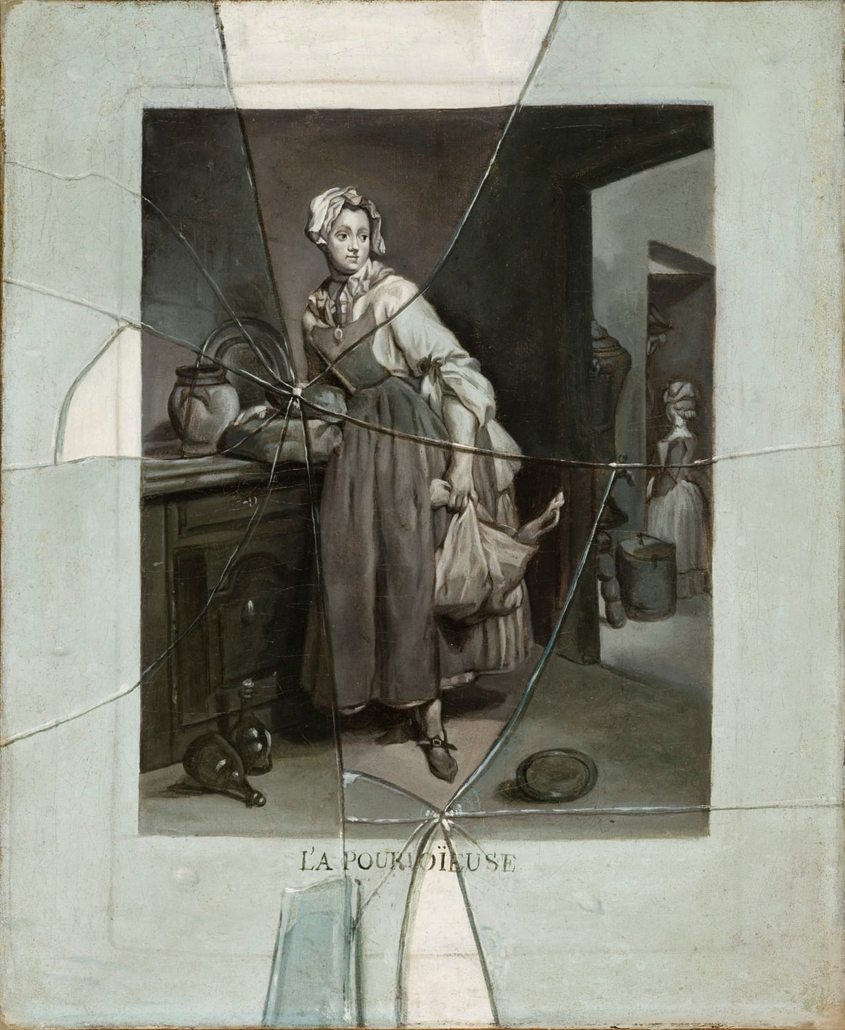
Tate Britain briefly paused their chronological timeline to take a look at some of the fashionable paintings aside from portraits and religious iconography. Trompe l’oeil paintings were particularly popular during the late Stuart period. The paintings tricked the eye into believing what they saw was real and three-dimensional. Charles II had a collection of this type of artwork as did his successors. Trompe L’Oeil of a Violin and Bow Hanging on a Door (after 1674) is a prime example of the style. The artist, Jan van der Vaart (1647-1721) was primarily a portrait and landscape painter, however, he was also known for his depiction of violins. Realistically painted on canvas, the violin image was mounted on a wooden door through which a peg protrudes to make it appear the violin is hanging from it.
Another Dutch painter, Edward Collier (active 1662-1708) was also skilled in trompe l’oeil paintings. His favourite subjects to paint were newspapers, written notes, writing implements and wax seals. Using a single canvas, Collier painted these objects on top of a painted wooden background to make them appear as though they were all positioned in a letter rack on a wall. The details on the newspaper are so fine that they appear they have been printed rather than written by hand. Rather than signing the painting in the corner, Collier addressed the letter in the painting to a “Mr E. Collier, Painter at London”.
Hyper-realistic paintings of flowers were also all the rage during the Stuart period. Dutch artist Samuel van Hoogstraten, who came to London in 1662, was interested in both art and science and joined the Royal Society, a society that promoted scientific experimentation and the study of the natural world. Combining both his passions, van Hoogstraten painted “perfect mirrors” of nature, making his paintings of flowers appear tangible, as though viewers could reach out and touch them. Inspired by this, other artists began replicating the style, such as Simon Verelst (1644-1717) who came to London from the Netherlands in 1669. Samuel Pepys (1633-1703), the famous diarist, recalled seeing Verelst’s painting of a vase of flowers and admitted he had to check over and over again that what he was seeing was a painting and not a real plant.


Architecture was significantly influenced by the Baroque style and was particularly associated with Christopher Wren (1632-1723), Surveyor-General of the King’s Works. As well as being an architect, Wren was also an anatomist, astronomer, geometer, and mathematician-physicist, however, the latter two also impacted his designs. Wren was also familiar with classical architecture and had insight into Louis XIV’s building projects in Paris. Due to this, Wren was able to produce designs for buildings that expressed the magnificence, beauty and strength of the nation.
Wren was responsible for many of the great buildings built in the late Stuart era, including Hampton Court Palace and Greenwich Hospital. His most famous achievement, however, was the reconstruction of St Paul’s Cathedral following the Great Fire of London. Large columns, porticos, ornaments and domes were typical features of Baroque buildings and were befitting of the royal courts who commissioned them.
In 1709, Sir James Thornhill (1675-1734) won a competition to paint the dome of St Paul’s Cathedral but the painting was delayed because ministers could not agree on what type of paintings would be most appropriate. Being an Anglican church, they wanted to avoid the flamboyancy of Catholic decoration but simultaneously did not want anything too bland. Finally, it was agreed the paintings would illustrate eight episodes of St Paul’s life, for instance, the burning of the books at Ephesus and appearing before Agrippa. Rather than using the typical bright colours associated with Catholicism, Thornhill worked in monochrome, allowing the paintings to enhance the “grandeur and modesty” of the building.
Later, Thornhill was invited to decorate the Painted Hall at Greenwich Hospital, which is considered to be the most spectacular painted interior of the Stuart era. Interior paintings and murals were an important feature of Stuart buildings, particularly in palaces and country houses. The paintings demonstrated the wealth of the owners whose notability was expressed through allegorical subjects from ancient history and classical mythology.

View of Chatsworth – Jan Siberechts
Country houses were also a way of demonstrating the wealth of the aristocracy. Inspired by Wren’s buildings, architects, such as William Talman (1650–1719), Nicholas Hawksmoor (1661-1736) and John Vanbrugh (1664-1726), designed grand luxuriant buildings set in Anglo-French style gardens. Chatsworth House, for example, commissioned by William Cavendish, 1st Duke of Devonshire (1640-1704), rivalled royal residences. Designed by Talman, the house had a palatial feel, which was enhanced by the fountains and statues in the gardens.


The Battle of the Boyne on 1st July 1690 in Ireland saw the victory of William III over James II. William, the son of Prince William II of Orange (1626-50) was James’s nephew and the husband of his cousin Mary. James was unpopular with Protestant Britain who feared a revival of Catholicism, so William invaded England in what became known as the Glorious Revolution and deposed his uncle. Under normal circumstances, the crown would have fallen to the eldest son of James II and Mary of Modena, however, the heir apparent was also Catholic. It had been declared all Catholics were now excluded from the throne. So, the crown fell to Mary and her husband William as joint sovereigns.
The Protestant royal court had many similarities with Charles II’s court, particularly where portraits were concerned. Beauty was considered to be a valuable quality for women and was often celebrated in poetry and painting. In 1690, Mary II commissioned a set of eight full-length portraits of the most beautiful women at her court. These were painted by Godfrey Kneller (1646-1723) and hung in the Water Gallery at Hampton Court. Known as the Hampton Court Beauties, the women are dressed in expensive silks to compliment their appearance and express their nobility.
Among the Hampton Court Beauties were Diana de Vere (1679-1742), who went on to become Duchess of St Albans and Margaret Cecil (1672-1728), the daughter of the 3rd Earl of Salisbury. Hanging in the same room at Tate Britain is a portrait of Princess Anne, the future queen, however, her portrait was painted by Willem Wissing (1656-87) who had, unfortunately, passed away before Mary II commissioned the Hampton Court Beauties.

The Royal Family were not the only people to commission portraits of “beauties”. For the mansion Petworth House, the 6th Duke and Duchess of Somerset commissioned a set of full-length portraits depicting the most beautiful women to represent their family and connections. Ranging from mid-teens to thirty, the Petworth Beauties were painted by the Swedish artist Michael Dahl (1659-1743) and hung with full-length mirrors between them, so that guests could compare their inferior appearance with the paintings.
Until recently, the Petworth Beauties were believed to be half-length portraits. This is because during the 1820s, the current owner of the house, the 3rd Earl of Egremont, decided to “cut off their legs” to create more hanging room for other paintings. In 1995, the National Trust discovered the paintings had not been cut but folded up behind the frame. Although damaged, restoration teams worked hard to save the legs and the paintings have been successfully restored. Tate Britain displays two of the Petworth Beauties, the Duchess of Ormonde and the Duchess of Devonshire, but unless told, any damage is unnoticeable.

, and His Army at the Siege of Namur, 1695")
Whilst female members of court represented beauty and innocence, the monarch represented authority and the might of the nation. For the majority of William and Mary’s reigns, Britain was at war, therefore, it is no surprise that paintings of William represent his war achievements. From 1688 until 1697, Britain, alongside the Dutch Republic, Holy Roman Empire Spain and Savoy, fought in the Nine Year’s War against Louis XIV. Following this, Britain was involved in the War of the Spanish Succession (1701-13).
Triumphant monarchs were always painted on horseback to symbolise their sovereignty, such as in Jan Wyck’s painting William III. Although war rages on behind him, William remains in control of his horse whilst holding a sceptre. In reality, William would have held a military baton and the sceptre was merely a symbolic element of the painting.
Jan Wyck painted another scene from the Nine Year’s War showing William III and his army at the Seige of Namur in 1695. This was one of William’s greatest victories and he can be seen on horseback amongst his officers. In the background, smoke from artillery fire obscures the view, implying the fighting is not yet over. Although William is made to appear superior and in charge, it also suggests he did not partake in the physical warfare.

Queen Anne – Michael Dahl
Portraits of Queen Anne, the sister of childless Mary II, who came to the throne in 1702, were never used to represent military victory since she was female. Instead, the Queen represented peace. She also became associated with politics after Michael Dahl painted a full-length painting of Anne to be hung in the Bell Tavern where the Tory October Club held their meetings. Whether they had the support of Anne is unknown but the painting implied to others that they did. Dahl was the unofficial artist of Queen Anne’s husband, Prince George of Denmark, therefore, he may have been affiliated with the Tories.
Since 1689, the monarchy played less of a role in political life and the running of the nation was left to Parliament. The Whigs were in opposition to absolute monarchy, whereas the Tories identified with the traditions of the Stuart kings and queens.

The Whig Junto – John James Baker
Political elections began to be held every three years, therefore, politics was a constant concern. Political clubs, such as the Whig Kit-Cat club were formed to be able to discuss politics and tactics away from the royal court and government. Members of the club were a mix of politicians, aristocrats and writers who were usually depicted as lively, happy people in their portraits, which was a stark contrast to the leaders of the Whigs who wanted to uphold social status. The “Whig Junto” as the leaders were known consisted of six men: the 3rd Earl of Sunderland, the 1st Marquess of Wharton, the 1st Baron Somers, the 1st Earl of Halifax, the 2nd Duke of Devonshire and the 1st Earl of Orford, who commissioned John James Baker (active 1685-1725) to paint them seated around a table at one of the country meeting houses. Despite the Roman military victory symbols in the painting, the Whigs soon lost power.


Although Queen Anne’s power was gradually diminishing, it was still worth gaining her favour. Despite political changes, people were still of the view that magnificent displays of power and status were important. Godfrey Kneller, who had been Principal Painter of Mary II, continued painting full-length images of courtiers and aristocrats. As time went on, however, politicians were added to the mix, such as the diplomat Matthew Prior (1664-1721).
Those with connections to the royal family also began to be seen as less important, such as Isabella Bennet, Duchess of Grafton (1668-1723) who Kneller painted with her son Charles FitzRoy (1683-1757). When she was only four years old, Isabella was married to Charles II’s illegitimate son Henry FitzRoy (1663-90). Isabella had been one of the Hampton Court Beauties but in this painting, she is older and widowed. The presence of her son gazing up at her was to try and remind people of her royal connections.
One of the final paintings in the exhibition is of Sarah, the Duchess of Marlborough (1660-1744) and Viscountess Fitzharding (1654-1708) playing a game of cards. Sarah was once a favourite of Queen Anne but after Sarah and Fitzharding developed a close friendship, the Queen was said to be full of rage and jealousy. Perhaps this was a sign that having a connection with the monarchy was becoming less important?
Tate Britain successfully takes visitors on a journey from the beginning of British Baroque to its final stages. Comparing the paintings in the final rooms with the bright, colourful ones in the first reveals that by the 1700s, Baroque style was on its way out, making room for the Georgian period. Nonetheless, evidence of the Baroque era remains today in buildings, such as St Paul’s, and hundreds of paintings. Subsequently, the artworks reveal the lives of those involved with the Stuart monarchy and how they used art to convey power or at least imply it through illusions. With many works on public display for the first time, British Baroque: Power and Illusion is worth visiting to explore an overlooked era of art history.
British Baroque: Power and Illusion is open until 19th April 2020. Tickets are £16 for adults, £5 for under 18s and free for under 12s. Tate Britain warns that some paintings show aspects of slavery and may be upsetting for some people.
My blogs are now available to listen to as podcasts on the following platforms: Anchor, Breaker, Google Podcasts, Pocket Casts and Spotify.
If you would like to support my blog, become a Patreon from £5p/m or “buy me a coffee” for £3. Thank You!