
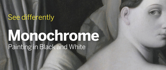
Detail from Jean-Auguste-Dominique Ingres and workshop, ‘Odalisque in Grisaille’, about 1824–34
Spanning 700 years of art, the National Gallery’s Autumn/Winter exhibition focused on the world of shadow with over 50 paintings produced with a limited colour palette. Monochrome: Painting in Black and White explored the reasons artists, both Old Masters and modern, reduced their selection of paint to white, black and grey, and the effects this produced. Beginning in the Middle Ages, the exhibition spanned seven rooms, each tackling a different time period or aspect. For a medium that is usually full of colour, monochrome paintings alter the manner in which artists work as well as the way their audience perceives them.
As shown in a video at the beginning of the exhibition, curators Lelia Packer and Jennifer Sliwka explained the various reasons an artist may prefer to work in black and white. The reduction of colour helps to focus the viewers’ attention on a particular subject, concept or technique. What may have been missed in a painting full of colour, is exaggerated by its absence. Working in monochrome allows the artist to experiment with form, texture and mark making, with particular emphasis on light and shadow.
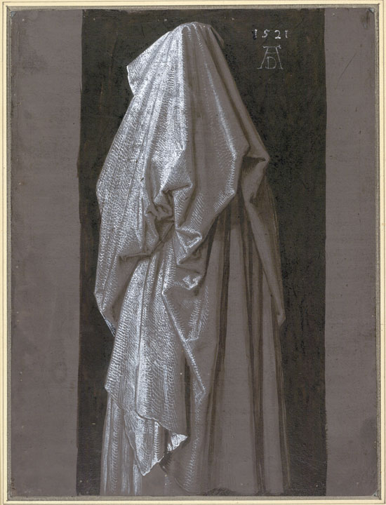
A Woman in Netherlandish Dress Seen from Behind – Albrecht Dürer
During the 16th century, most artists were producing colourful paintings, influenced by the rapidly growing Renaissance movement originating in Italy. Yet, the National Gallery managed to produce examples of monochrome painting from this era. Black and white paint was a lot cheaper than the majority of coloured pigments, therefore it was more economical for artists wishing to practice on a separate canvas before completing their final piece, to do so in grey tones. This also allowed artists to work out how light should fall upon their figures or models and to determine which sections would be obscured by shadow.
The use of monochrome within artworks, however, began a long time before the Renaissance era. The exhibition introduces visitors to the term grisaille which defines “a painting executed entirely in shades of grey or of another neutral greyish colour.” This method first appeared in the middle ages, particularly in buildings belonging to the Cistercian Monks. Prohibiting colour by religious command, the stained glass windows of many 13th century churches were created with translucent glass in various grey tones, the opposite to the vibrant, eye-catching patterns that Christian structures contain today. This was an attempt at eliminating distraction from prayer and devotion to God; whether this was successful is undivulged.
An example of grisaille stained glass windows is the ‘stained glass panel with quarries and a female head’ owned by the Victoria and Albert Museum, dating back to circa 1320-24. As can be seen, the glass was not totally black and white, however, the only colour to feature is yellow, which the monks were unlikely to find off-putting.
Another example of a monochrome sacred subject is a four and a half metre high indigo cloth decorated with white paint to represent events in the life of Jesus. Titled Agony in the Garden, this is a portable cloth originally created in Genoa in 1538, that could be moved from one chapel to another and be reassembled anywhere it is needed. To be produced only in white paint is extremely impressive. The tones and shadows have been created by the amount of paint applied, the more the brighter, which is the opposite method when using black paint.


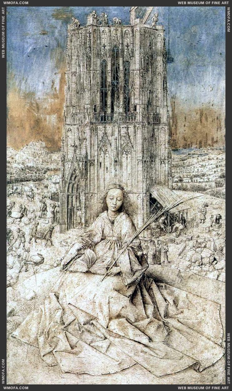
St Barbara 1437 Eyck, Jan van
Putting these sacred relics to one side, the earliest independent painting in grisaille, i.e. produced deliberately in monochrome, is Saint Barbara painted by Jan van Eyck (1390-1441) in 1437. It shows the early Christian Saint Barbara imprisoned in a tower by her pagan father. There is, however, some debate amongst art historians as to whether van Eyck intended the painting to remain black and white. The background of the canvas has been filled with blue and ultramarine paint, but the intentions behind this are unclear. Some argue that the colour draws attention to the ink and oil drawing in the foreground, whereas others insist the pen and brush strokes are an underdrawing for an unfinished painting – it was, after all, produced in the final years of van Eycks life. The only thing standing in the way of the latter debate is the date and signature of the artist found on the panel.
Regardless as to whether van Eyck was the first to experiment with monochrome painting, the origins of grisaille remain in the Netherlands area. Rembrandt van Rijn‘s (1606-69) famous Ecce Homo is an example of this technique, however, one Dutch artist became known for creating most of his work in monochrome. This was Adriaen van de Venne (1589-1662) who produced numerous grisaille paintings of peasants, beggars, thieves and characters of comic value.
Grisaille paved the way for artists to discover how to accurately represent stone in their paintings, particularly statues. This led to a rise in the technique called Trompe-l’œil (“deceive the eye”) in which the paintings are so realistic they create an optical illusion, making their subjects appear three dimensional. This lead to a paragone (comparison) debate amongst late Renaissance artists over which form of art – sculpture or painting – was the most superior. The painting was the most affordable of the two art forms, therefore, when artists began achieving the Trompe-l’oeil technique with the help of monochrome shading, commisions for fake carvings began to rise. Take, for example, Jacob de Wit’s (1695-1754) Jupiter and Ganymede. Produced in an era without electric lighting, it could easily be mistaken for the real thing.


Black and white artwork is far cheaper than coloured, which is something many artists kept in mind. Although paintings sell for millions nowadays, they were not as highly valued at the time of their completion. As paintings took a long time to complete, artists were frequently struggling to make ends meet in between successful payments. However, there was a solution to this predicament: printmaking. From the 1430s onwards, techniques such as etching and engraving became popular within the art world. Rather than selling one unique painting, an artist or fellow printmaker could create a print of the artwork by etching on to a metal plate. This plate could be inked over and over again to create as many copies of the print as desired. Whilst artists could not charge the same amount for a print than they could for a painting, they were able to sell far more copies than they would otherwise.
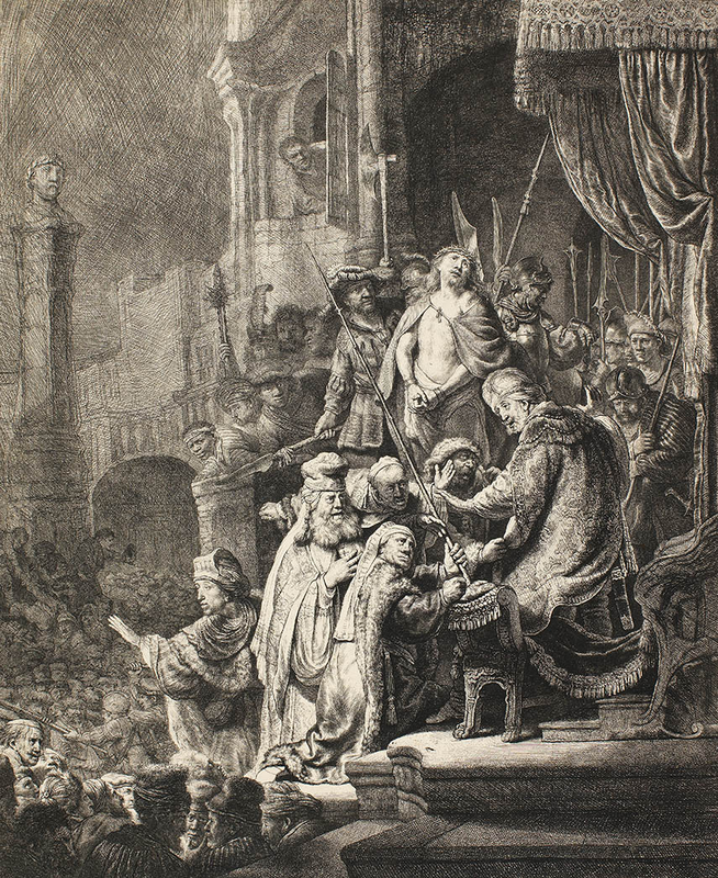
Ecce Homo print, van Vliet
Midway through the exhibition, the National Gallery showed examples of paintings and their corresponding prints. Often, a student or an apprentice would create the print on the artist’s behalf, thus being able to study the techniques of their master and perfect their drawing abilities.
One example is the print of Rembrandt’s Ecce Homo, which was produced by another Dutch artist, Johannes van Vliet (c.1610). The linear design is a contrast to the brushstrokes of the original, however, some may prefer imagery in this fashion.
Hendrick Goltzius (1558-1617) was an early graphic artist who preferred the effect of printmaking over the traditional painting. He is now regarded as the pioneer of “pen-painting”, a technique involving the use of pen and ink, drawn straight on to canvas, mimicking the look of a print. He was, therefore, able to produce artwork of considerable size, which would not have been possible on a printing press.
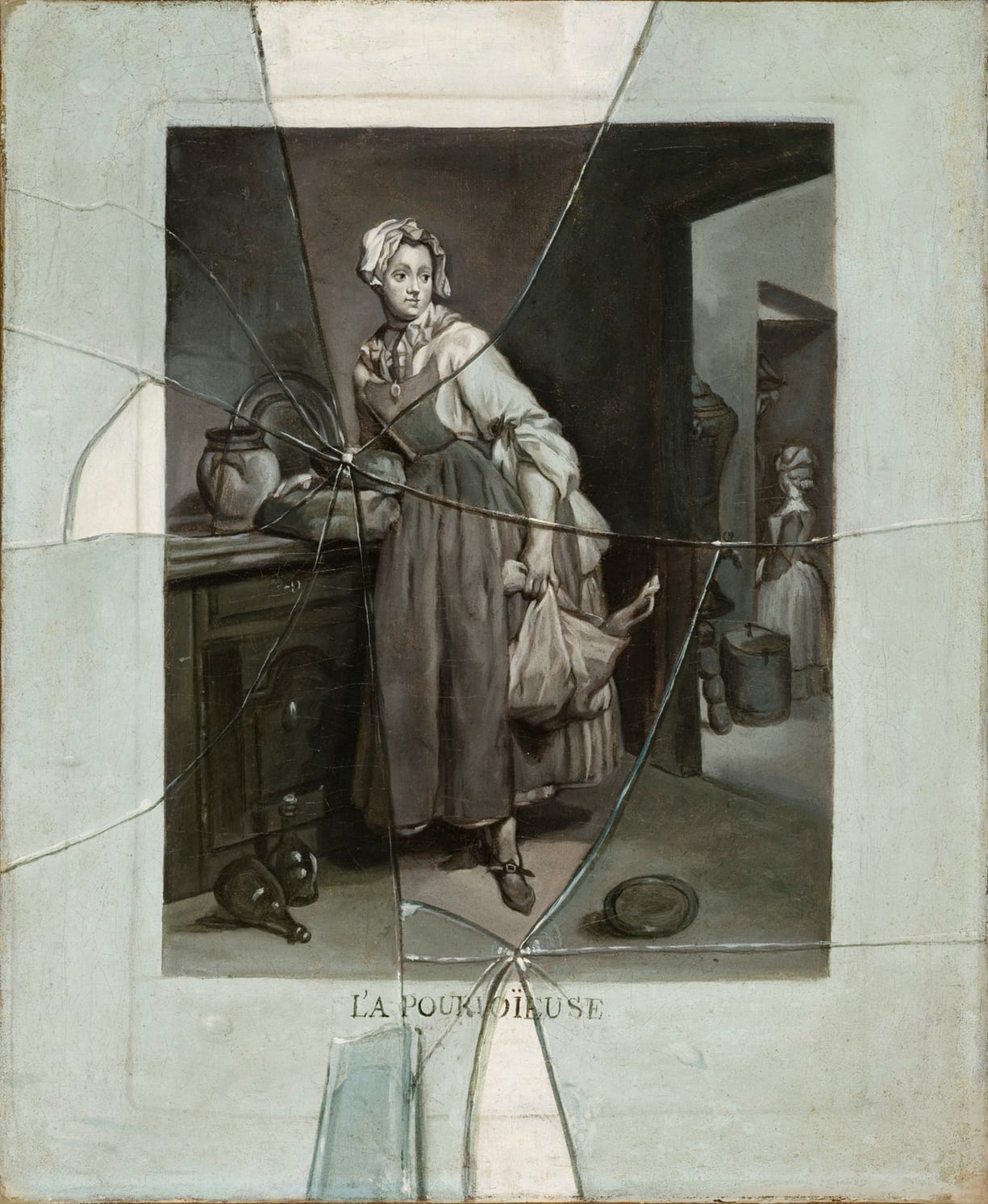
Etienne Moulinneuf’s Back from the Market, c.1770
Goltzius was not the only artist to paint print-like scenes. Alongside the original, coloured version of Back From the Market by Jean-Baptiste-Siméon Chardin (1699-1779), hung what appeared to be two prints, however, one was not what it initially seemed. In 1770, Étienne Moulinneuf (1706-89) painted the engraving of Back From the Market, mimicking the print-marks from the printing press. He then went one step further, emphasising the difference between reality and illusion, by painting a trompe-l’oeil of broken glass over the top. This gives the false appearance that the painting (or engraving) is framed and had, at one point, fallen off the wall.
As the exhibition reached its final rooms, the dates of the paintings caught up with the recent 20th century. By now, technology was rapidly advancing and numerous art movements were coming forward, challenging all the rules that artists had followed for centuries. One of the challenges artists had to overcome was the invention of the camera. Commission for portraits and realistic scenes were no longer as popular because the public could produce their own in a photographic format in a shorter timeframe and at a fraction of the cost. Some artists responded to this by painting hyper-realistic black and white portraits that could easily be mistaken for a photograph, whereas others went down a route leading to abstract expressionism.
Chuck Close (b.1940), an American painter, produced a portrait of fellow artist Joel Shapiro (b.1941) that a camera could not possibly achieve. Spanning from floor to ceiling, the canvas is filled with black, and white squares containing hand painted rings of a number of grey shades. From a distance, the squares blur together to produce the portrait of Joel in a similar way that pixels merge together to create a digital image.
Vija Celmins (b.1938), a Latvian-American painter, also blurs the lines between real and abstract. Her painting Night Sky No.3 shows the stars in a way that cannot be seen by the naked human eye. However, as the exhibition pointed out, is it a painting of the night sky, or is it only white dots on top of black paint?


The exhibition’s penultimate room is where abstraction comes to the fore. After looking at paintings from the Old Masters and other well-known names, it is difficult to regard these final works as art. One canvas contains a slightly angular black square and another canvas is filled with black lines. Nonetheless, the fact that they are produced “without colour” means they have a right to be in the Monochrome exhibition. Although many will not understand what these artists were attempting to achieve, the minimal colour draws attention to the shapes and texture of the paintings. At a time when all colours are readily available, the complete lack implies a hidden meaning.
The final room of the impressive Monochrome exhibition was perhaps the one visitors spent the least amount of time in, however, it was also the most interesting. Containing an installation that Olafur Eliasson (b.1967) developed in 1997, Room For One Colour allows the viewer to see themselves and the people around them in monochrome. The immersive sodium yellow mono-frequency lamps on the ceiling suppress all other light frequencies, thus creating a monochrome world. It is unsettling to no longer detect individual colours especially as this causes the lines and textures of facial features to become more prominent. Unfortunately, the lights are difficult for the eyes to bear for longer than a minute, leaving just enough time to read the explanation the gallery supplied. Nevertheless, it was a fun and unique conclusion to a magnificent exhibition.
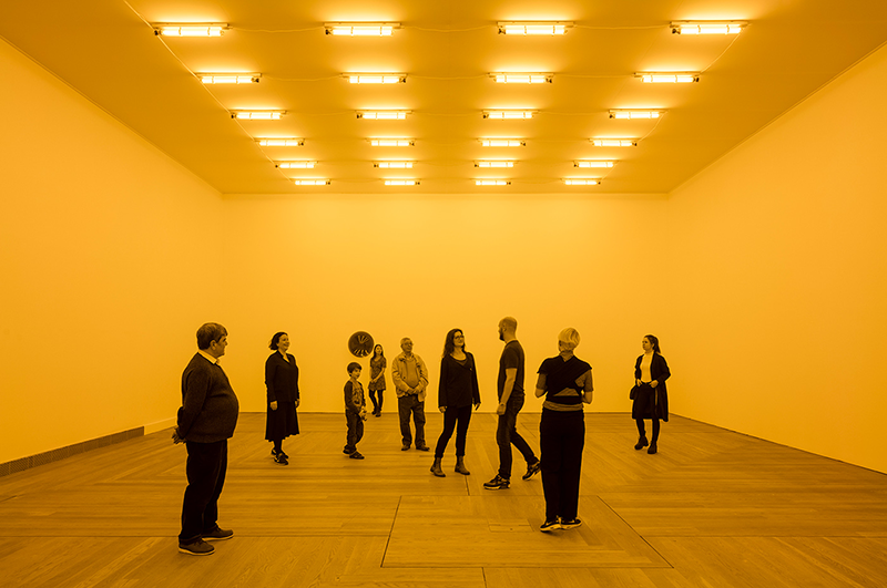
Room For One Colour
Unfortunately, Monochrome: Painting in Black and White closed on 18th February 2018 and many of the paintings will have returned to their original locations. However, that does not mean that grisaille, black and white, and monochrome art cannot continue to be celebrated. When attending any exhibition or art gallery, keep an eye open for the works with minimal colour and see how they compare to their more vibrant neighbours. Notice the tones, shading, shadows, and textures that may otherwise go unnoticed.
The National Gallery did a formidable job at introducing London to a colourless artworld. Not only did visitors get the opportunity to view paintings by 50 or so artists, a different way of looking at and producing art was presented. This was certainly one of the National Gallery’s top exhibitions.
“Artists choose to use black and white for aesthetic, emotional, and sometimes even for moral reasons. The historical continuity and diversity of monochrome from the Middle Ages to today demonstrate how crucial a theme it is in Western Art.”
National Gallery Director, Dr Gabriele Finaldi
